
Basic Charts
The Basic charts build visualizations based on the following types of columns:
A required binning column, whose values are broken down into discrete values, or bins.
A required summary column, whose values are aggregated for each bin. Some basics charts allow multiple summary columns.
An optional grouping column to produce subgroups of bins.
Chart Layouts
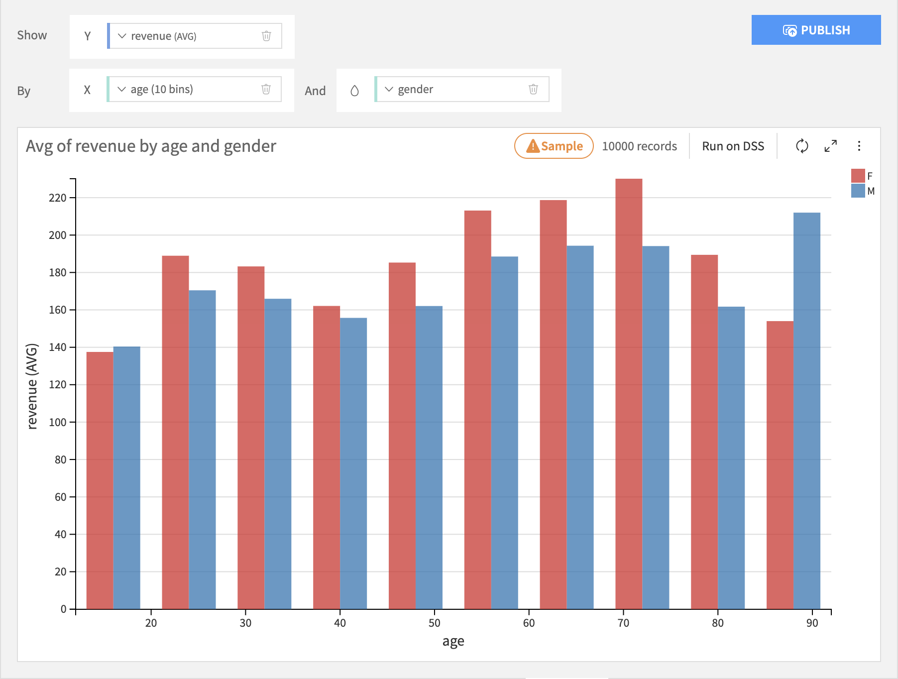
Bar
The Histogram layout puts the binning column on the X axis, the summary column on the Y axis, and creates separate bars for each subgroup for each bin.
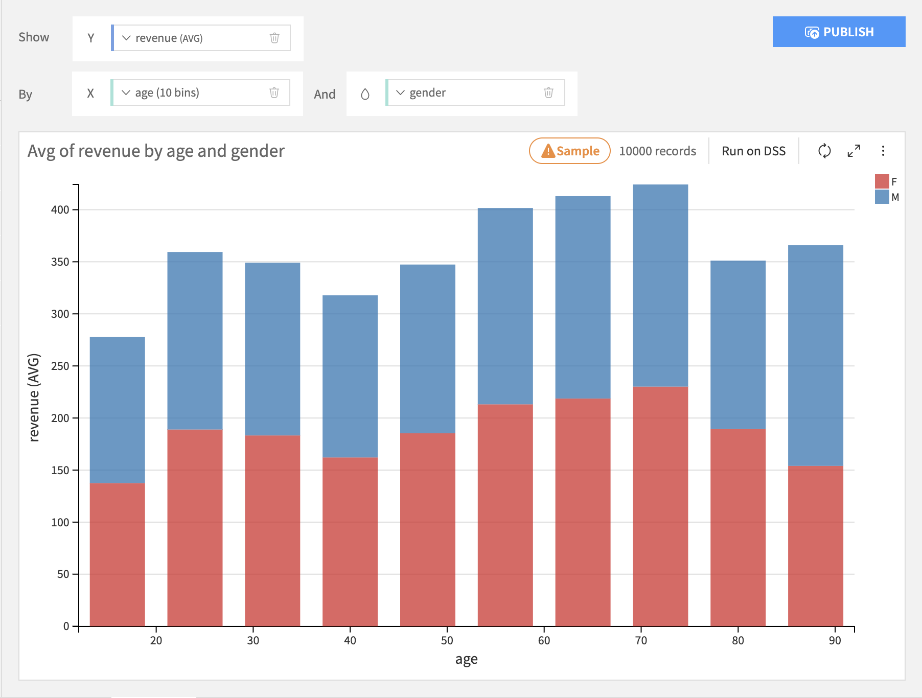
The Stacked layout puts the binning column on the X axis, the summary column on the Y axis, and stacks each subgroup within each bin.
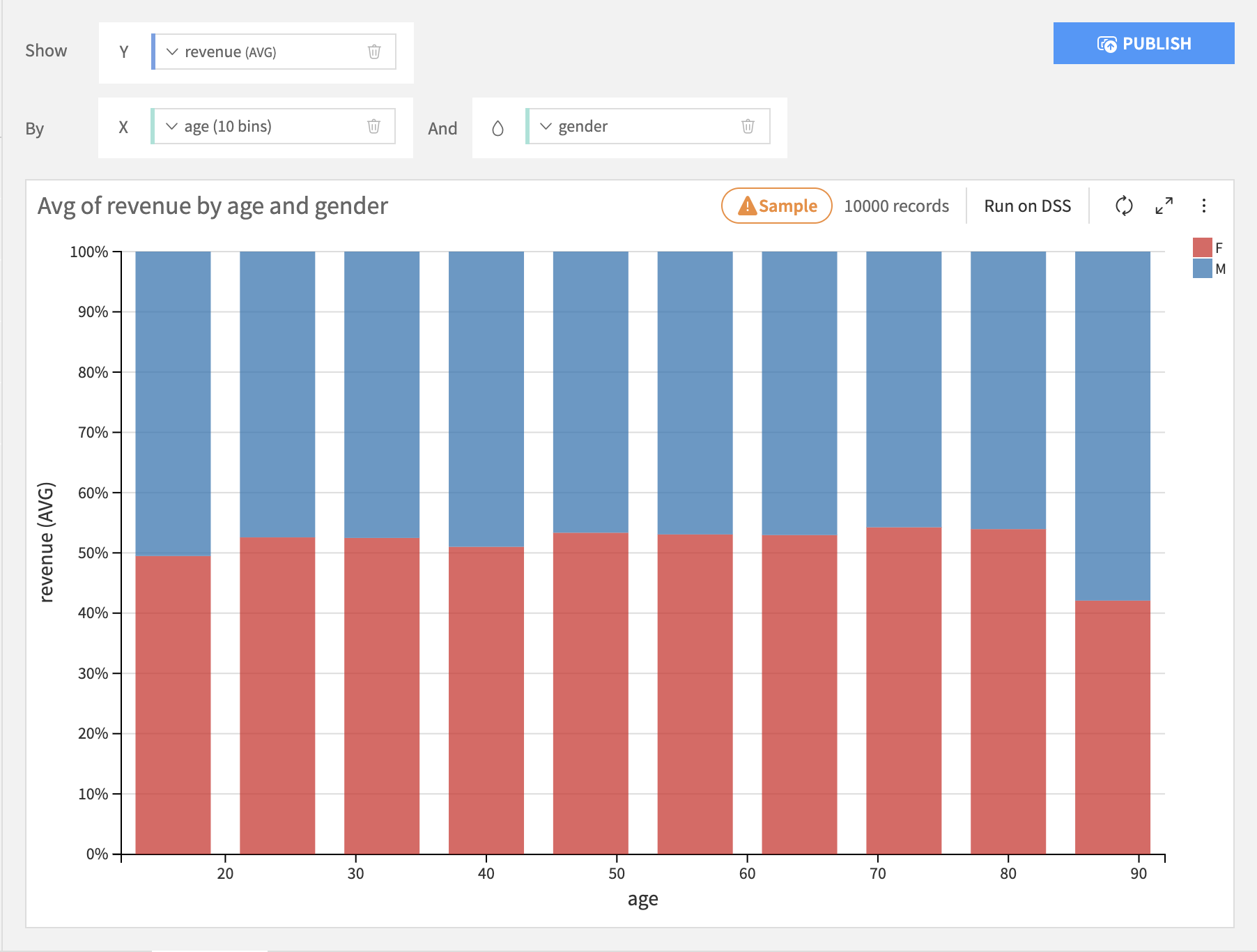
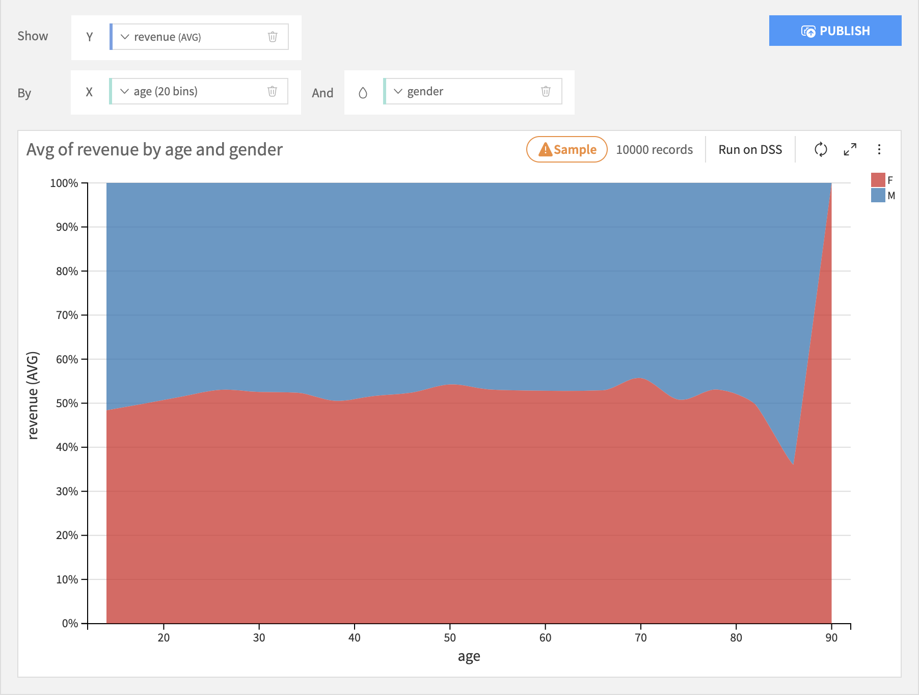
The Stacked 100% is just like the Stacked layout, but the height of each bar is normalized to 100%. This is useful for seeing differences across bins.
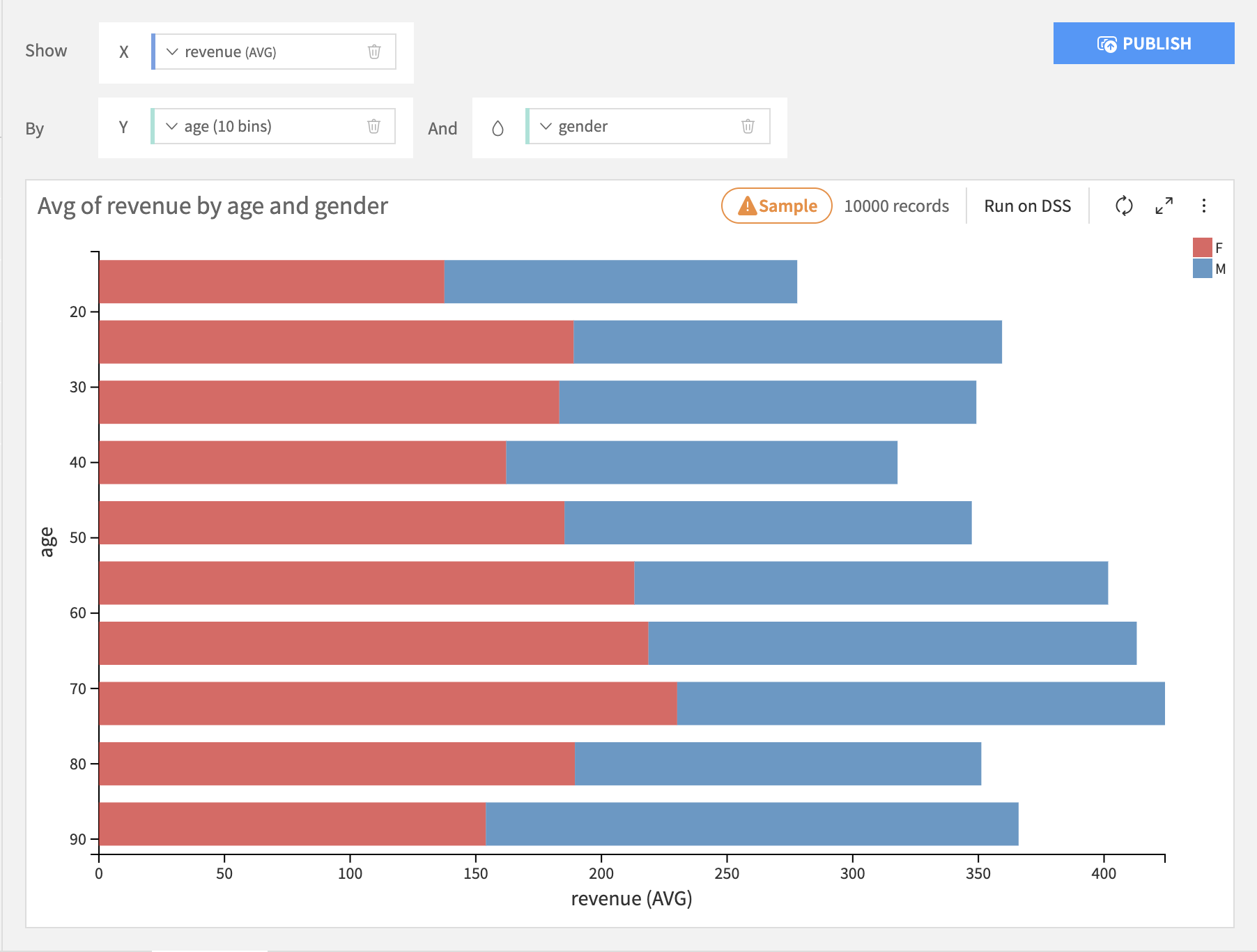
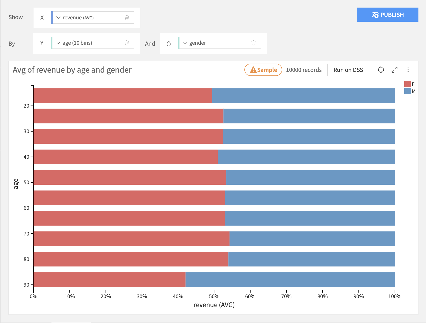
The Bars layout puts the binning column on the Y axis, the summary column on the X axis, and stacks each subgroup within each bin.
The Bars 100% layout is just like the Bars layout, but the length of each bar is normalized to 100%.
Lines & Curves
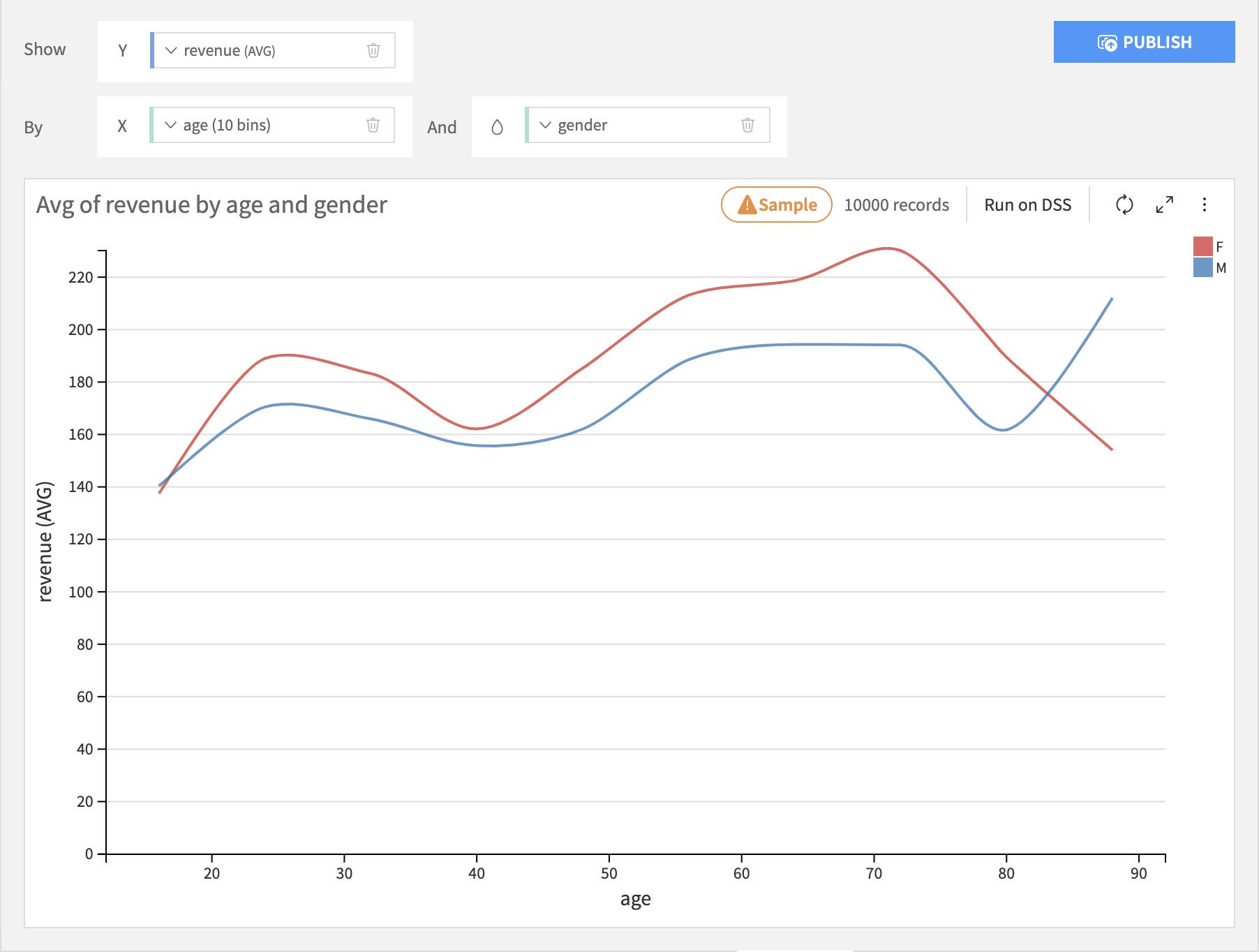
Lines & curves charts are generally most useful for comparing multiple subgroups or summary columns.
The Lines layout puts the binning column on the X axis, the line height column on the Y axis, and creates separate lines for each subgroup for each bin.
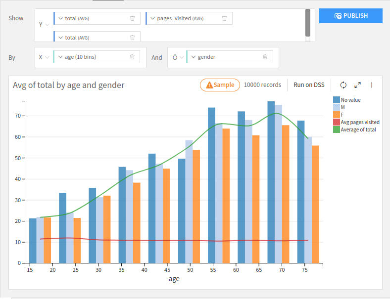
The Mixed layout puts the binning column on the X axis, for each height column on the Y axis and creates separate bars for each subgroup for each bin. You can choose whether to display it as a bar or line.
The Stacked Area layout works roughly like a Stacked Bar chart, but it will create a smooth area instead of columns.
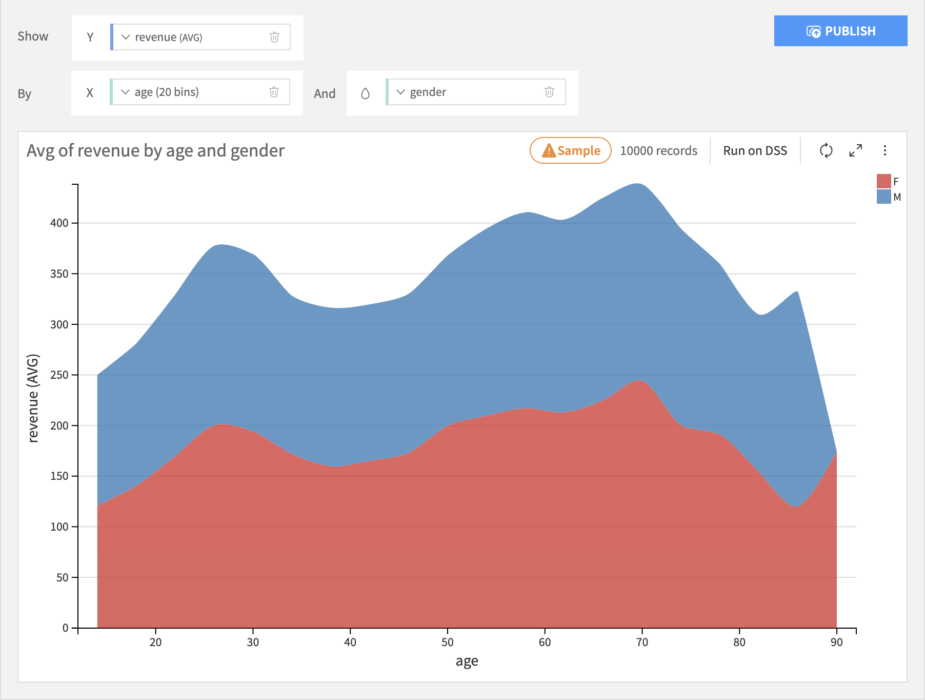
The Stacked Area 100% layout works roughly like a Stacked 100% Bar chart, but it will create a smooth area instead of columns.
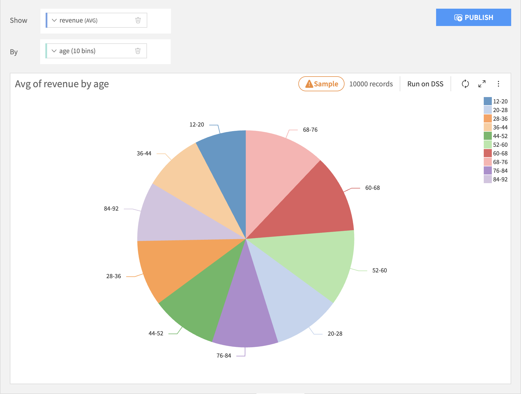
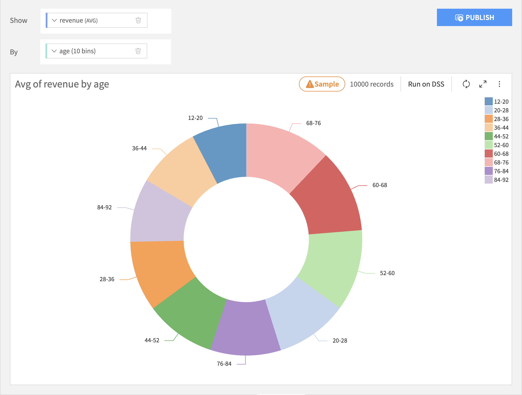
Pie & Donuts
Pie & donut charts are generally most appropriate when there is no inherent ordering of the bins.
Pie charts are like bar charts, but each bin is represented by a wedge in a circle, like a slice of pie. The size of each wedge is proportional to the sum total of all wedges. There is no subgrouping of wedges.
Donut charts are like pie charts, but with the middle removed.
Column Processing Options
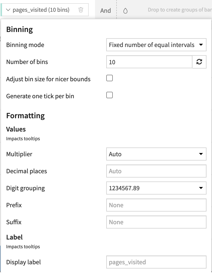
Binning Column
Set the binning rules by clicking on the name of the binning column.
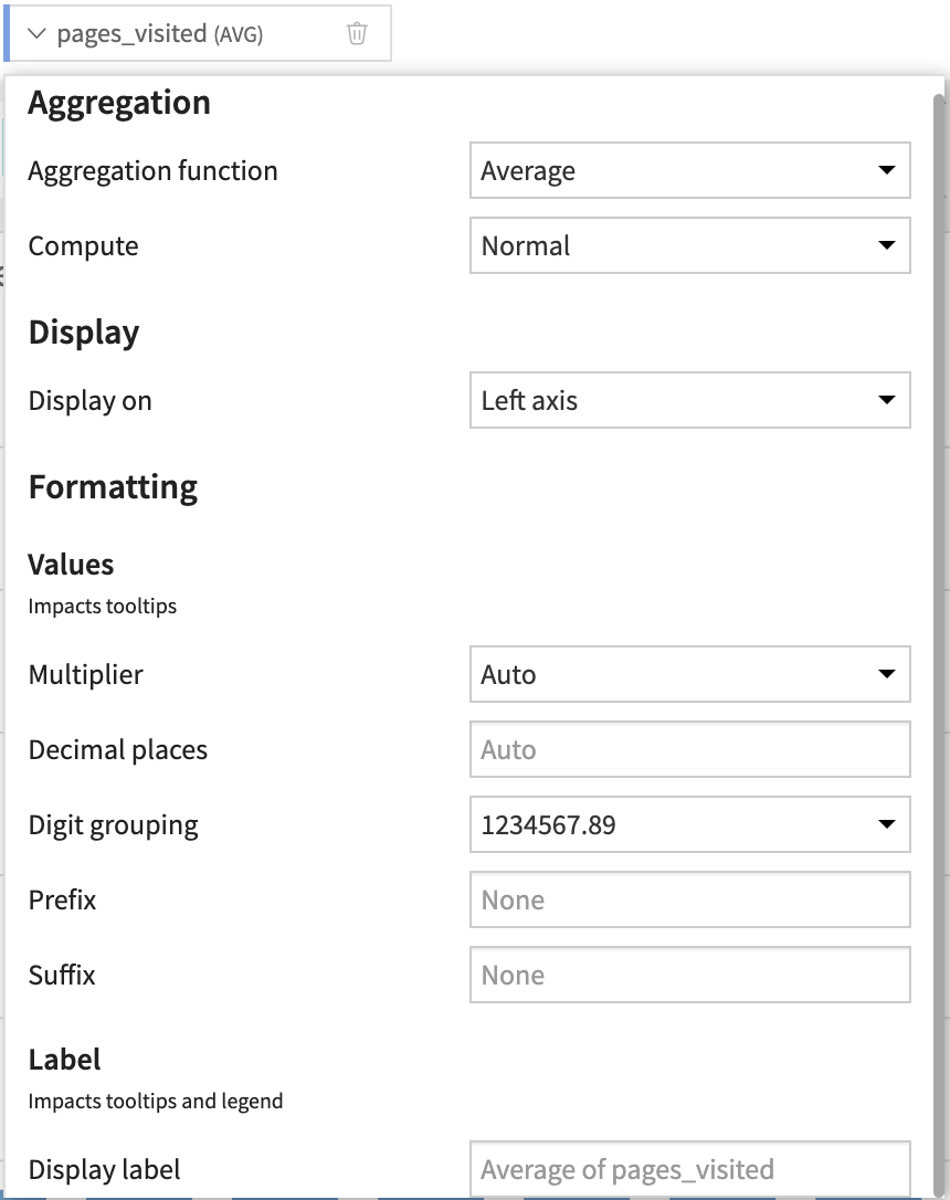
Summary Column
Set the aggregation rules by clicking on the name of the summary column.
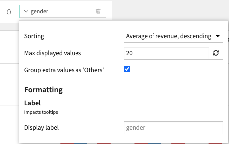
Grouping Column
Set the subgroup sorting rules by clicking on the name of the grouping column.
Note
It generally does not make sense to use the “AVERAGE” aggregation when creating subgroups of of bars. Only aggregations that “naturally stack” should be used: SUM and COUNT.
Compute modes
Compute modes determine the logic used to calculate chart values. By default, data is aggregated based on your chosen dimensions (such as binning or grouping) using standard functions like average or median.
Standard aggregation modes
Compute modes available for aggregated measures:
Normal (
NORMAL): displays the result of the aggregation function for each bin without additional calculations.Percentage scale (
PERCENTAGE): represents each bin’s aggregated value as a percentage of the total across the entire axis.Ratio to average (
AVG_RATIO): calculates the relative deviation from the mean using the formula \((value / average) - 1\).Example: a result of
0.2means the value is 20% above the average, while-0.2indicates it is 20% below the average.
Cumulative values (
CUMULATIVE): replaces individual bin values with a running total (cumulative sum) along the chart axis.Cumulative percentage scale (
CUMULATIVE_PERCENTAGE): calculates the running total and expresses it as a percentage of the overall total.Differential values (
DIFFERENCE): shows the change between the current and previous bin values; the first bin serves as the starting baseline.
Availability may vary depending on chart type.
Note
DIFFERENCE is available only when there is a single main breakdown axis.
Unaggregated measure modes
You can also choose to skip the standard aggregation for each bin and instead use a specific display mode:
STACK: keeps all distinct values within a bin and stacks them cumulatively.OVERLAY: keeps all distinct values within a bin and overlays them from the same base. The visible extent follows the maximum positive and minimum negative value.KEEP_FIRST: keeps only the first value found in the bin.KEEP_LAST: keeps only the last value found in the bin.
Note
KEEP_FIRST and KEEP_LAST depend on the row order used to compute the chart.
When using the SQL engine, the row order returned by the database is not deterministic by definition.