
Other Charts
These charts do not fit neatly into other classifications.
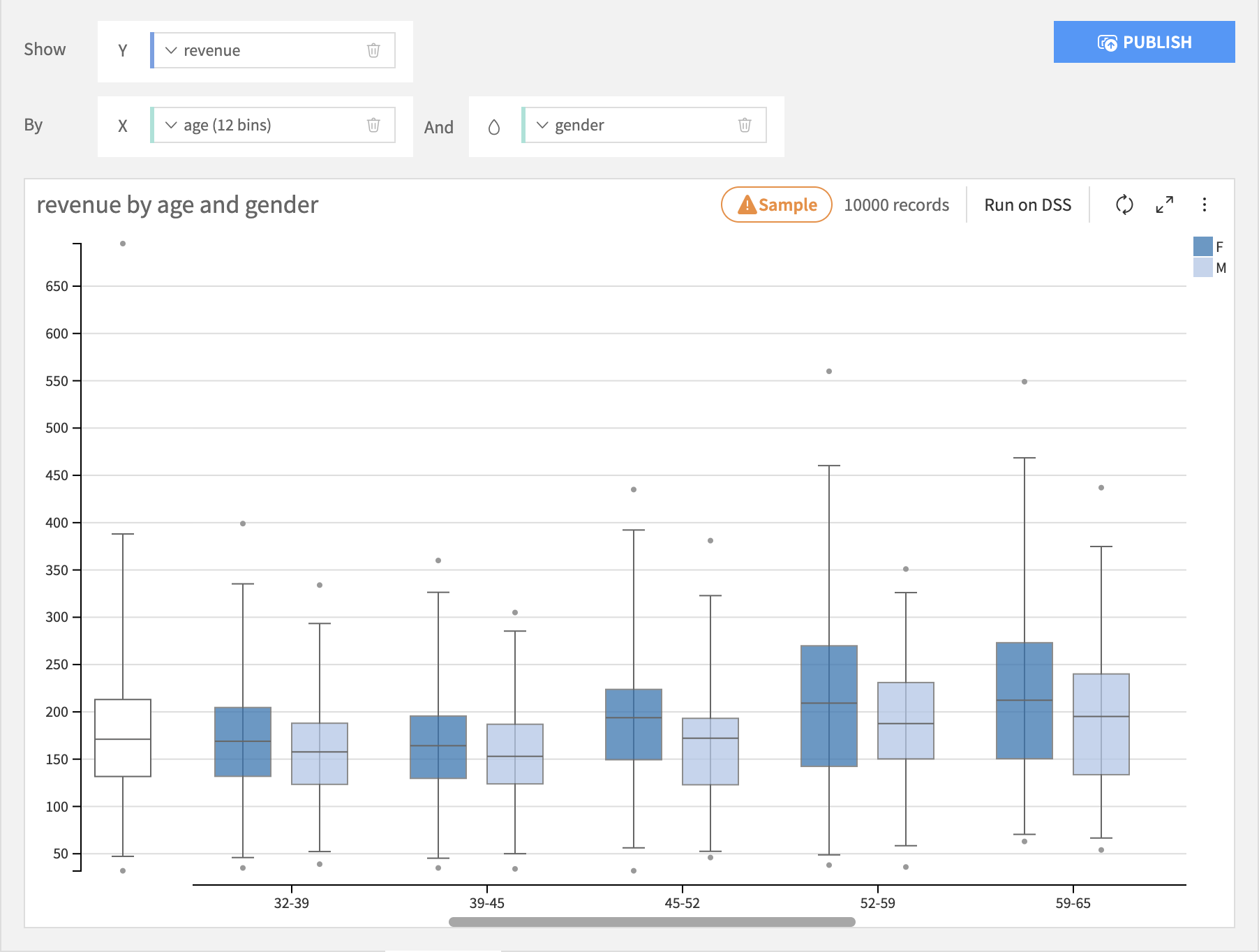
Boxplot
Boxplots build a visualization that shows you the distribution of a required Y axis column, possibly broken down by the bins of an optional X axis column and creates separate boxplots for each subgroup for each bin on the color axis. The Y axis column must be numeric, the X axis column can be numeric or text.
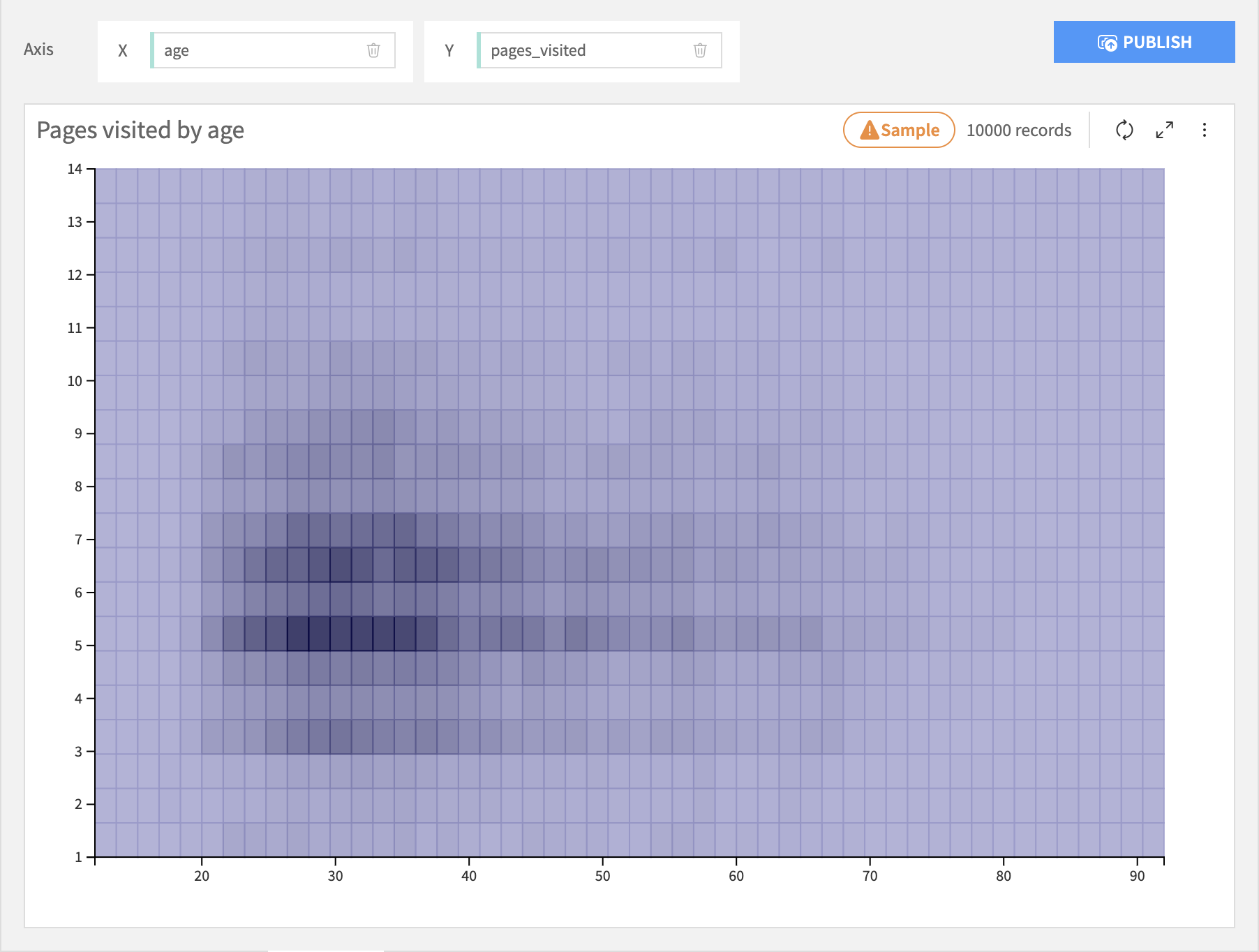
2D Distribution
The 2D Distribution chart builds a visualization that shows you the bivariate distribution of a required X axis column and a required Y axis column. Each column is binned and the resulting cells are colored by the relative density of rows in that cell.
Lift Chart
Warning
This chart type is deprecated. Lift charts are provided for models in Visual ML results.
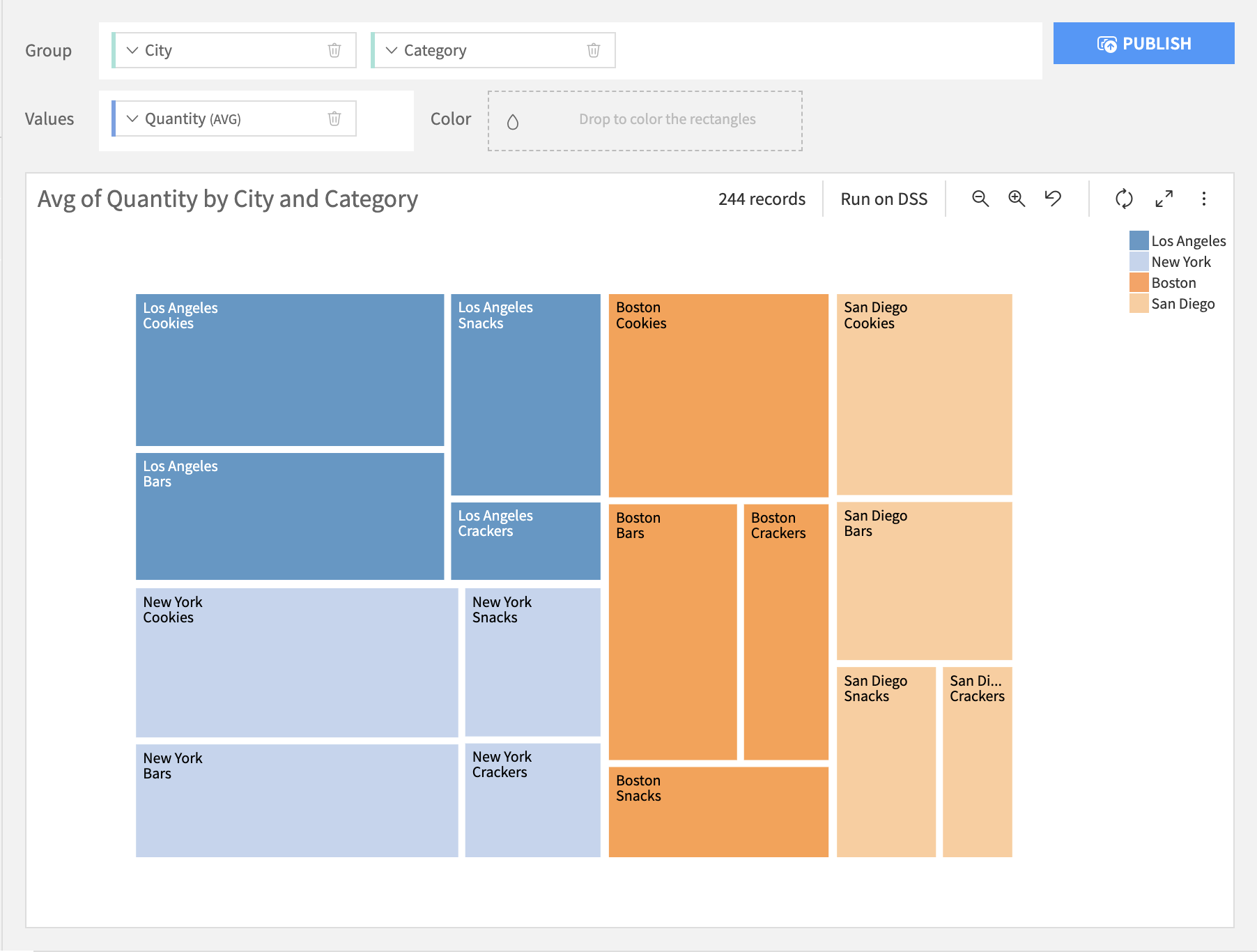
Treemap
Treemap charts build a visualization of the hierarchical structure of tree diagrams. Each parent node is represented by a rectangular area with its children nodes nested inside. The size of each area is dependent on the value of the corresponding node.
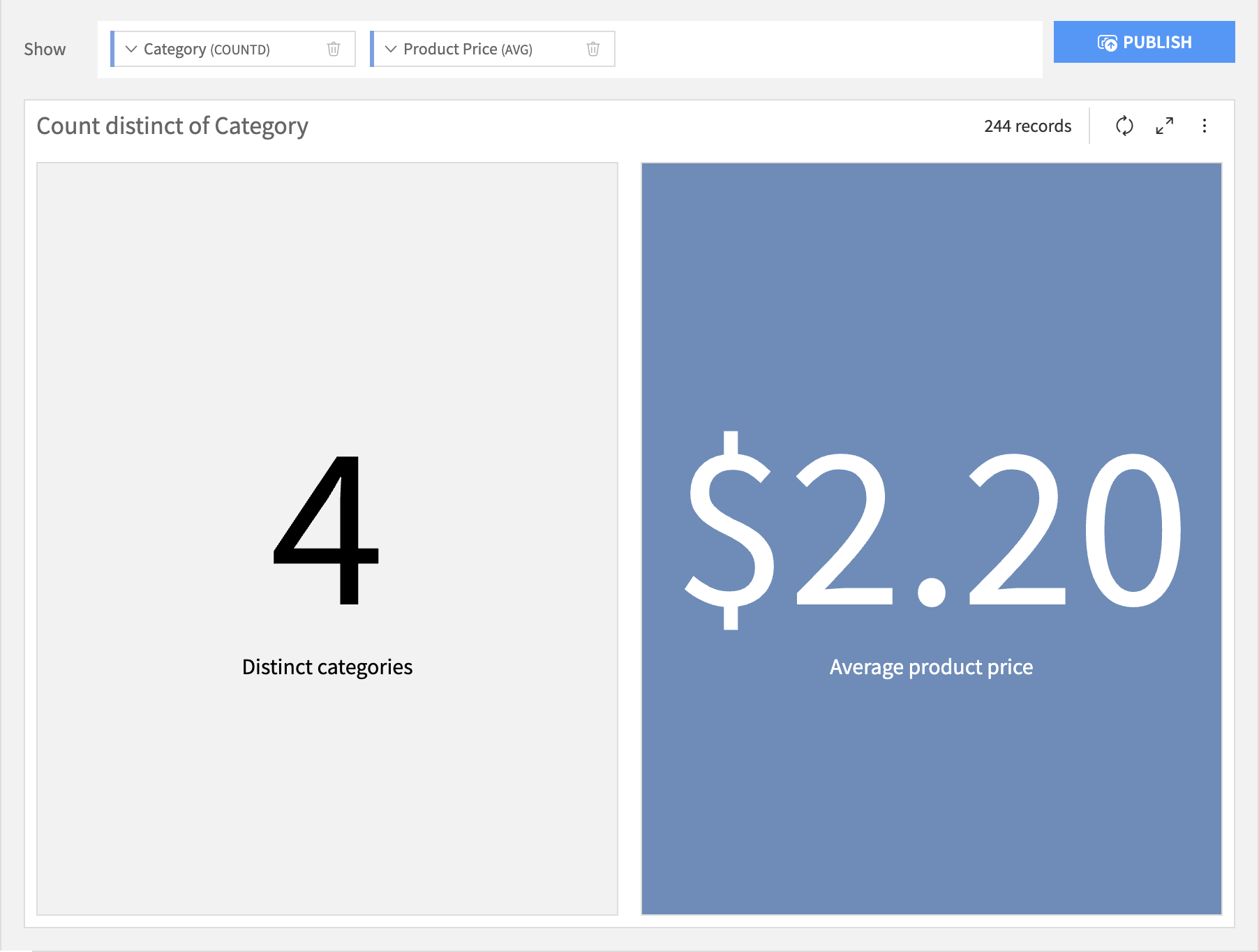
KPI
Standing for “Key Performance Indicator”, KPI charts build a simple value visualization for single or multiple aggregations.
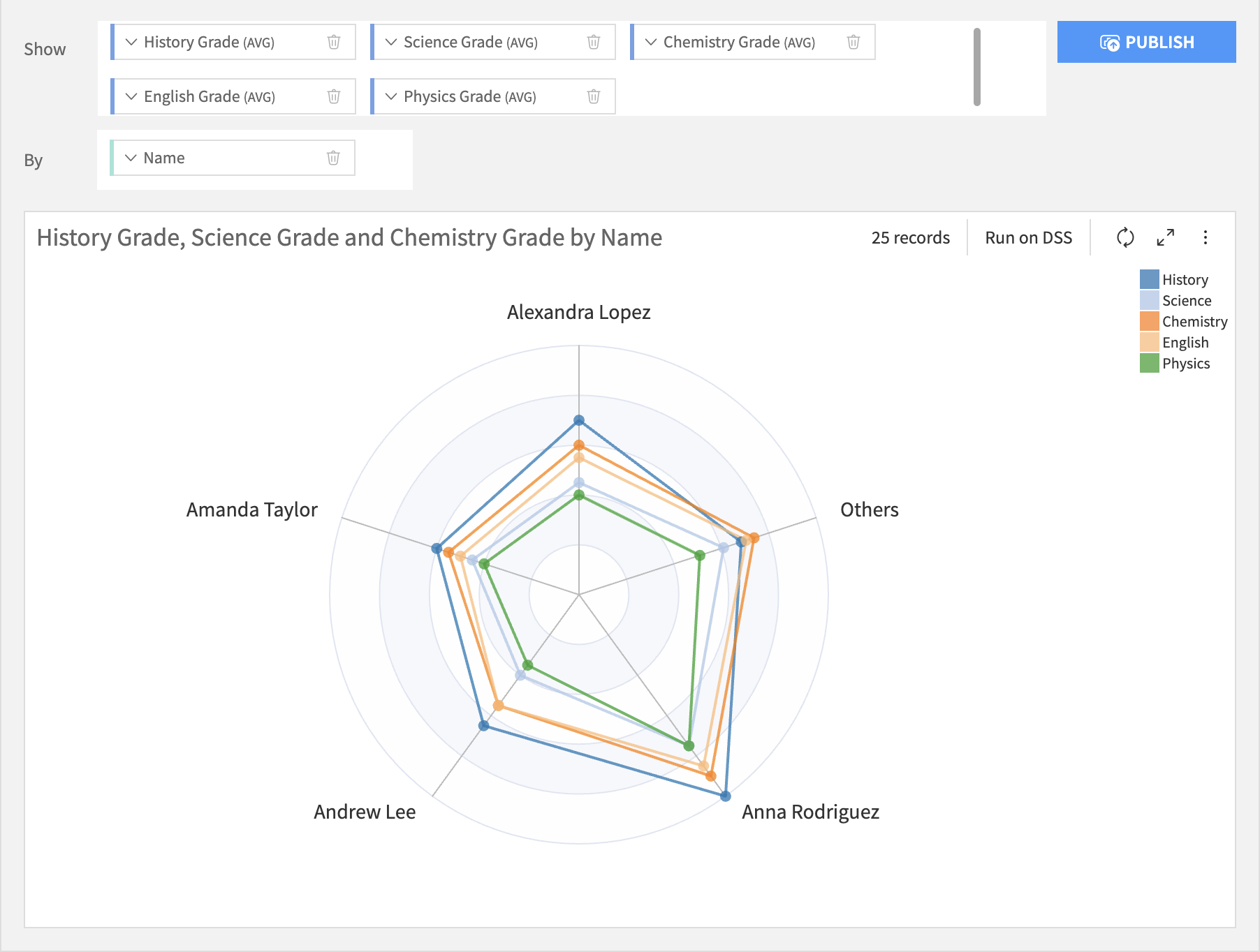
Radar
Radar charts are ideal for comparing multiple quantitative variable, each variable being displayed as a radial axis. The values of the same category are shown as polygon, of which each chart can have 1 or more.
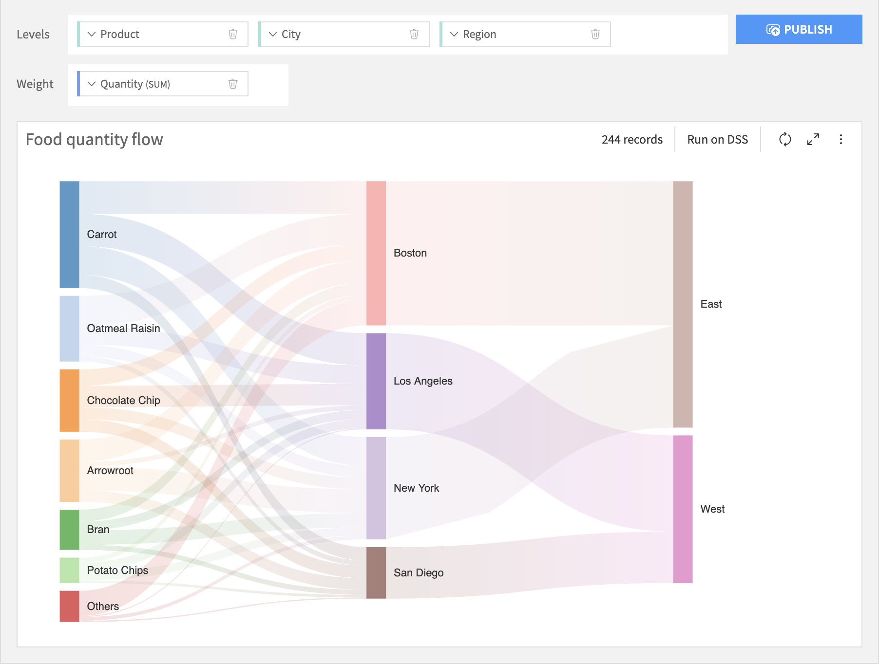
Sankey
A Sankey chart is used to depict the flow of resources, quantities, or values from one set of entities to another. It is a type of flow chart that illustrates data across different categories or stages.
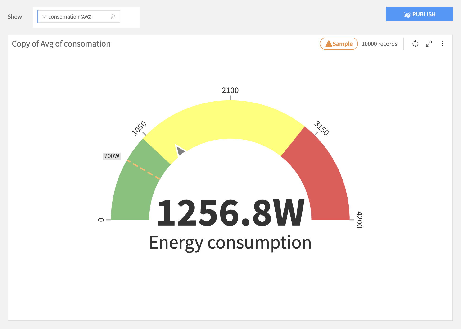
Gauge
The Gauge chart, also known as speedometer, is used to display data in a circular axis to demonstrate performance or progress. This axis can be colored to offer better segmentation and clarity.
Waterfall
A Waterfall chart is used to illustrate how an initial value is incrementally affected by a series of positive and negative variations. The horizontal axis can display one or two breakdowns, allowing you to analyze a measure across a single dimension or across two nested dimensions (e.g., variations of Result over Year and City).
With a single breakdown on the X axis, you can choose whether to display the Total bar, and control its position (left or right).
By default, waterfall bars use a dedicated color palette, with specific colors assigned to increases, decrease or totals.
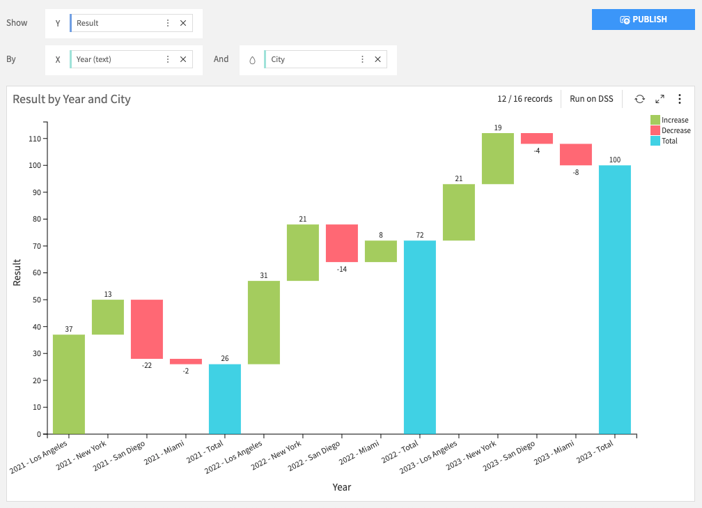
When two breakdowns are used on the X axis, the second dimension can be used as a color dimension, instead of standard waterfall colors.
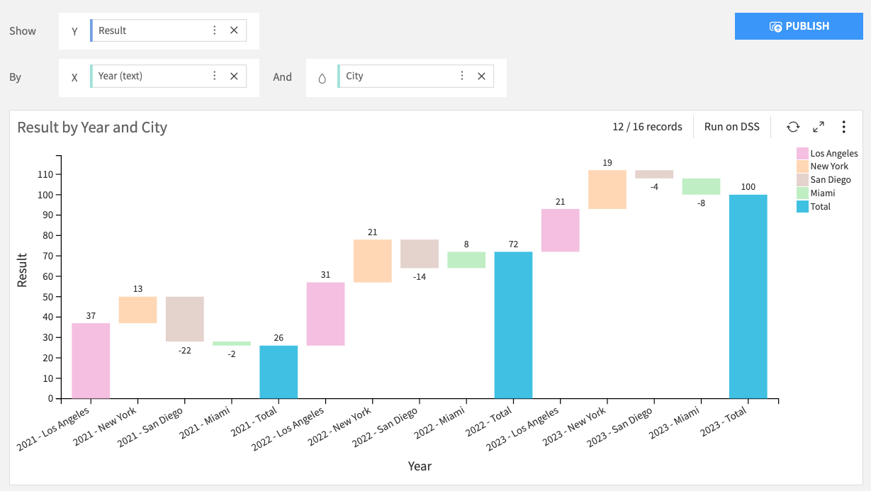
Waterfall charts use unaggregated data by default. This means that, for each bin, no aggregation (such as average or median) is computed. Instead, the chart displays either the first value (Keep first mode), or the last value (Keep last mode) retrieved from the dataset.
For details about standard and unaggregated compute modes, see Compute modes.
Note: Totals and subtotals can be automatically calculated or pulled directly from your dataset.