
Map Charts
Map charts let you display a dataset containing geographic features on a world map.
The Map charts build visualizations based a required Geo column, whose values can be geographic points or geometries.
Chart Layouts
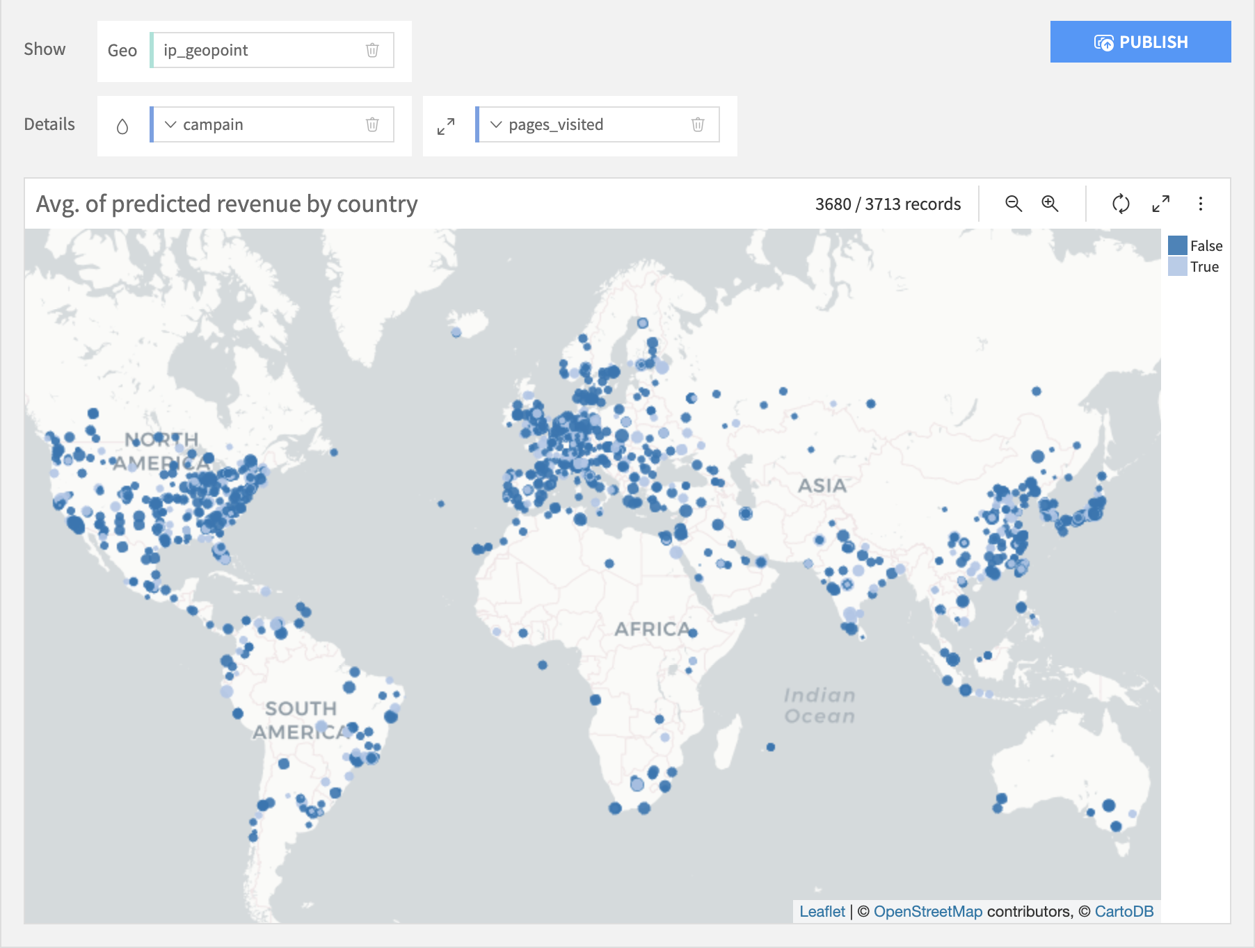
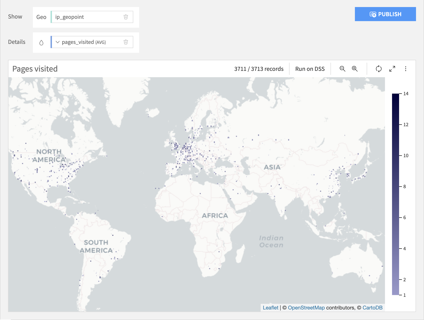
Scatter
The Scatter Map layout plots a point at each individual geopoint. It allows you to add optional Color and Size columns that change the color and size of the points based upon the column values. The Size column must be numeric, but the Color column can be text or numeric.
Geometry
The Geometry Map layout works best with geometries, but will work with geopoints, in which case it is like a Scatter Map with no Size column. A Geometry Map can display several geographical columns.
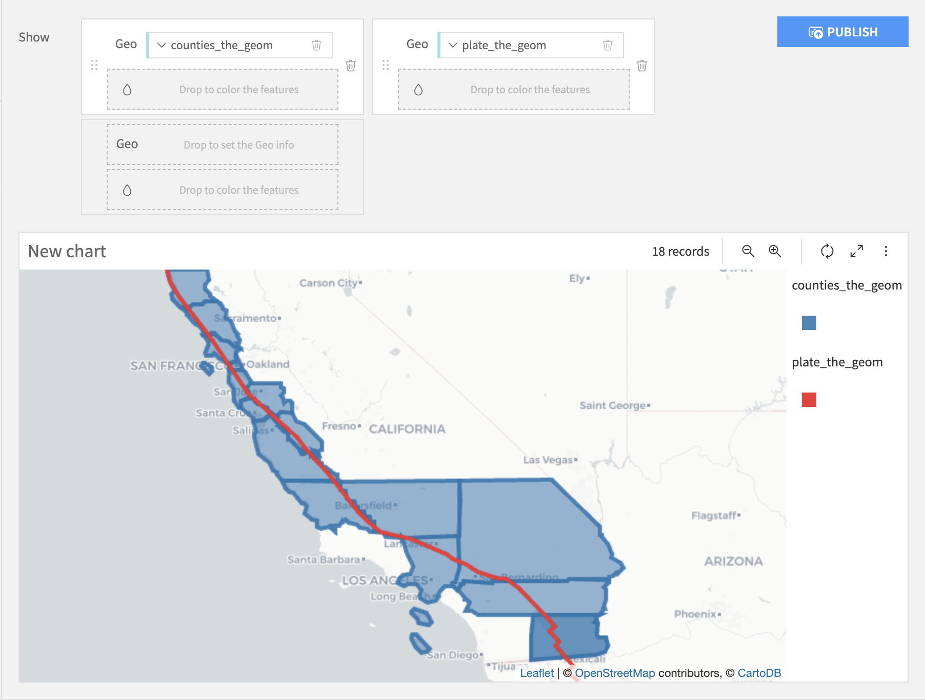
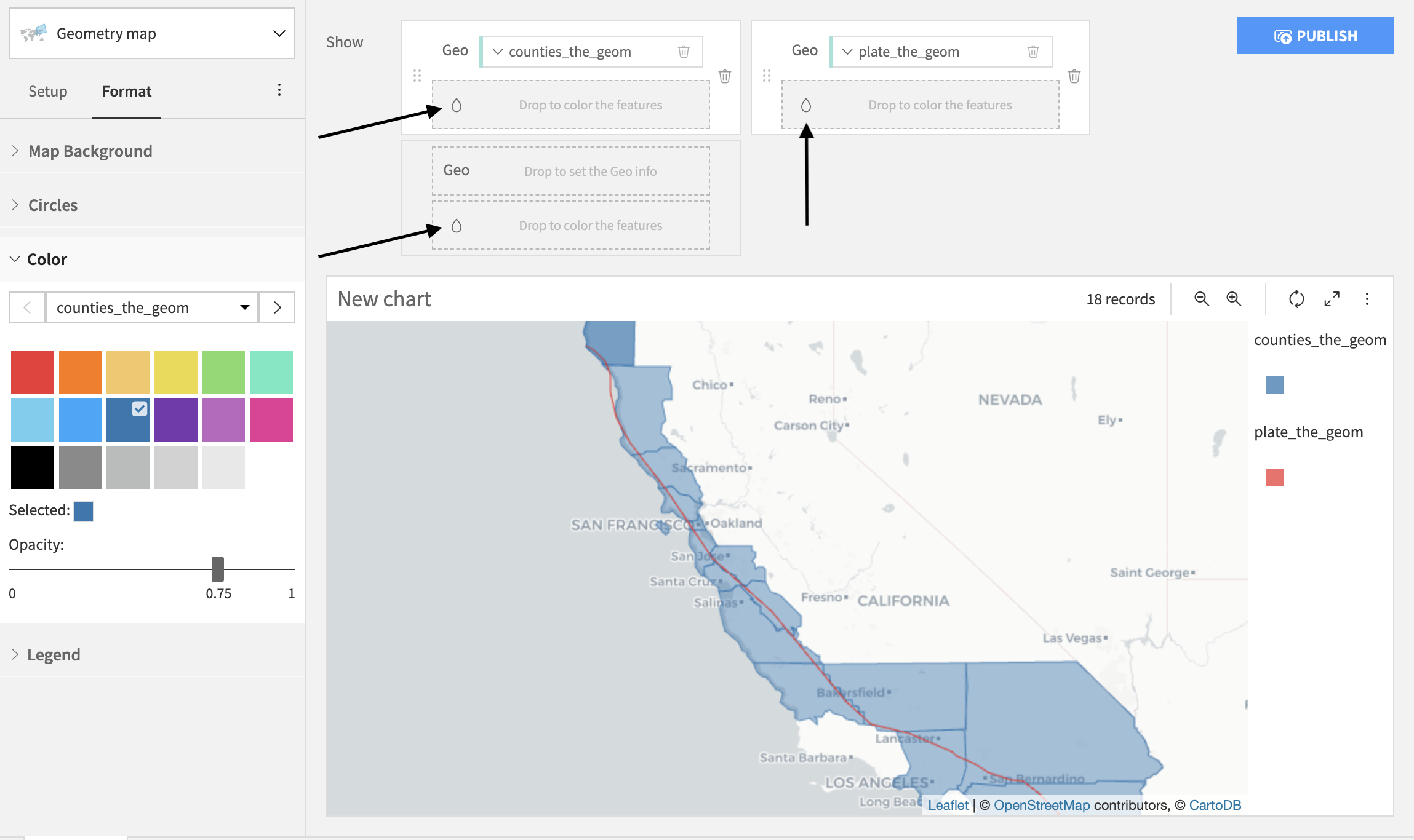
Choose the order of the geo layers
The order of the dragged geo columns determines the order of appearance of the geo layers on a map. Hence,
if a geo column “geometry” is added on the right hand side of another geo column, the chart will display the layer “geometry” on top.
if a geo column “geometry” is added under another geo column, the chart will display the layer “geometry” on top.
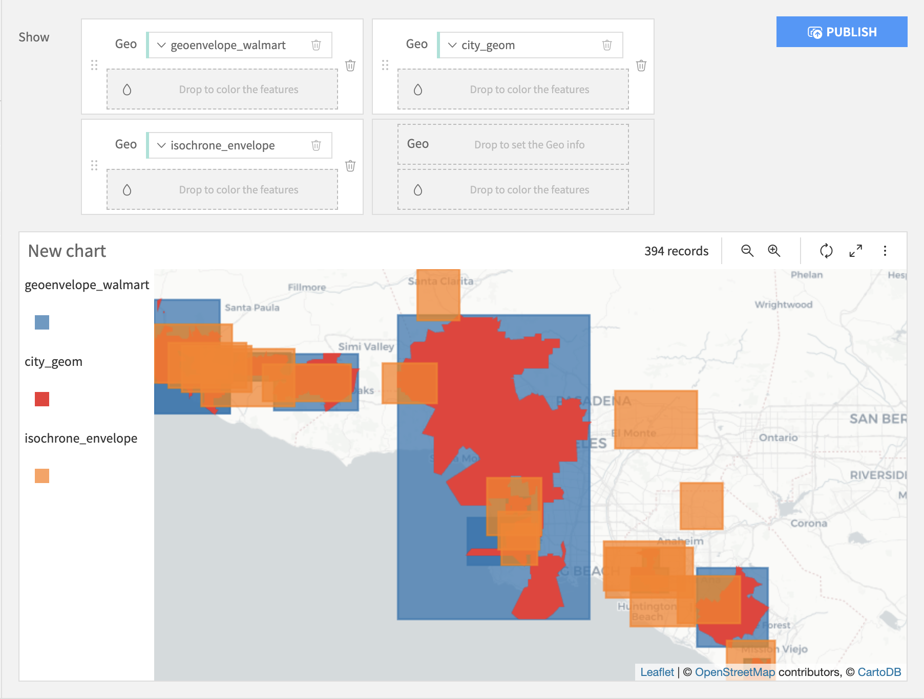
Therefore, the chart below plots :
the column “isochrone_envelope” (orange) on top
the column “city_geom” (red) in between the two layers
the column “geoenvelope_walmart” (blue) in the background
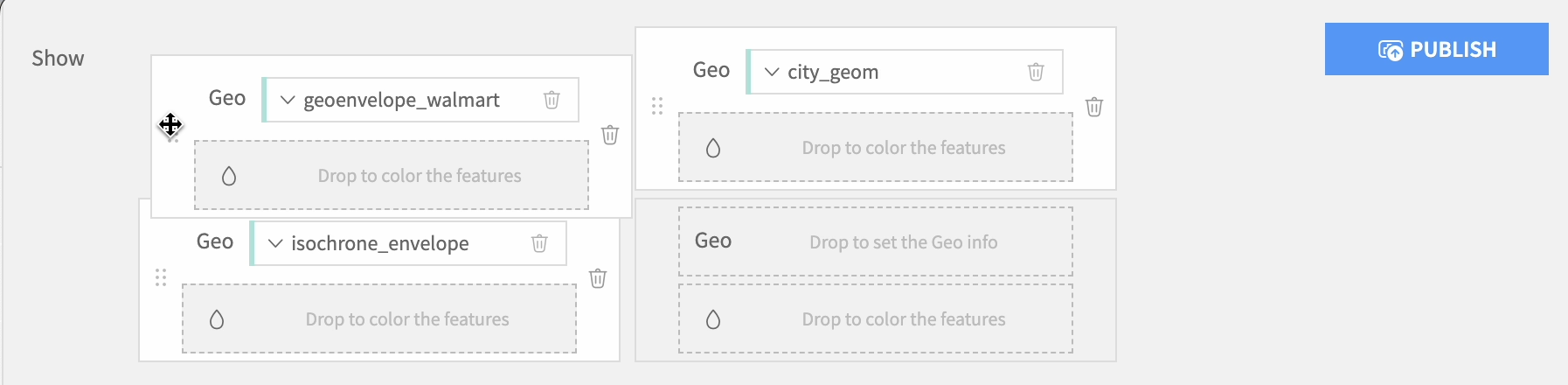
To change the order of the displayed layers, you may change the order of the geo columns by dragging and dropping them.
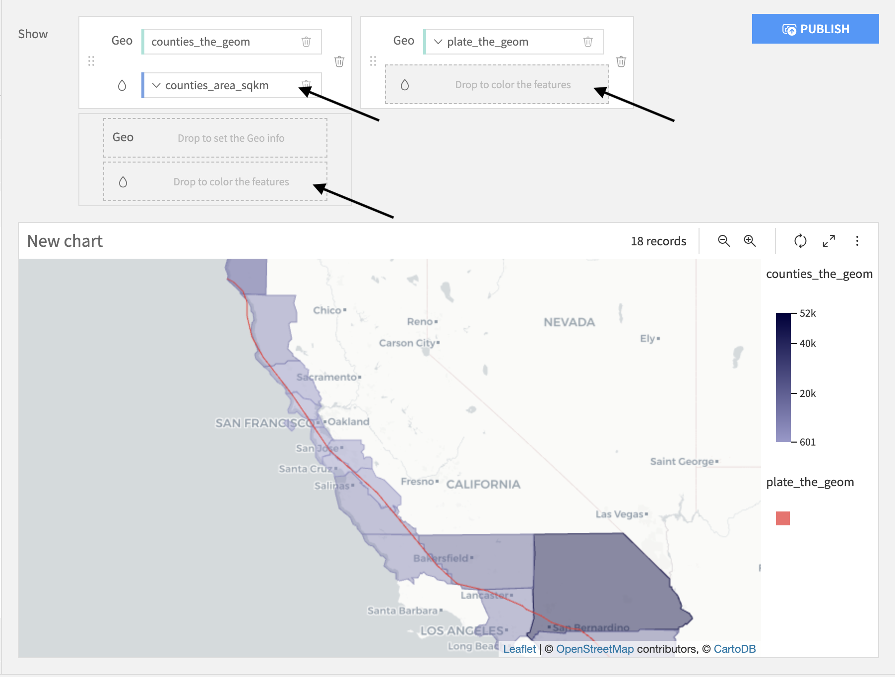
Set the colors
You can modify the colors by clicking on the “drop” button: ![]() of the geo column of your choice.
of the geo column of your choice.
For each geographical layer, you can add a color column to change the colors of the displayed geometries according to their values. For example, the chart below colors each county based on their area.
Aggregate geometries
If two geometries are equal, a Geometry map plots them twice. If you want to display duplicated geometries only once, set the Aggregate option to Make Unique.
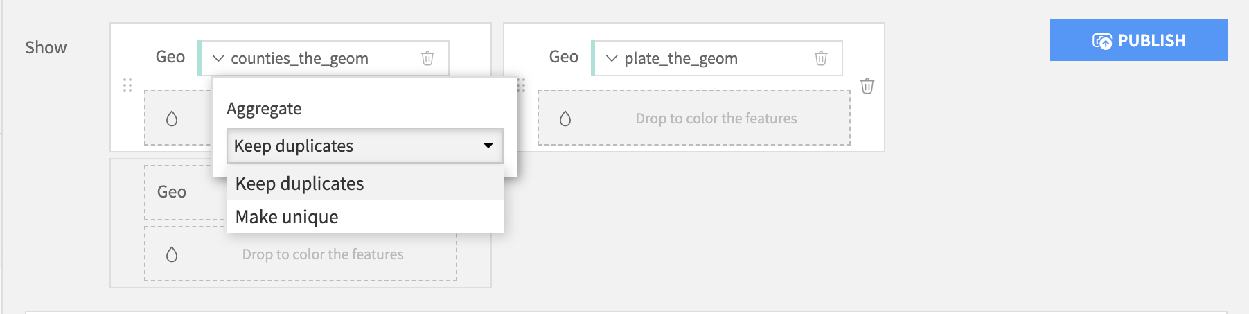
The “Make unique” option is only available for geometry columns without a color column.
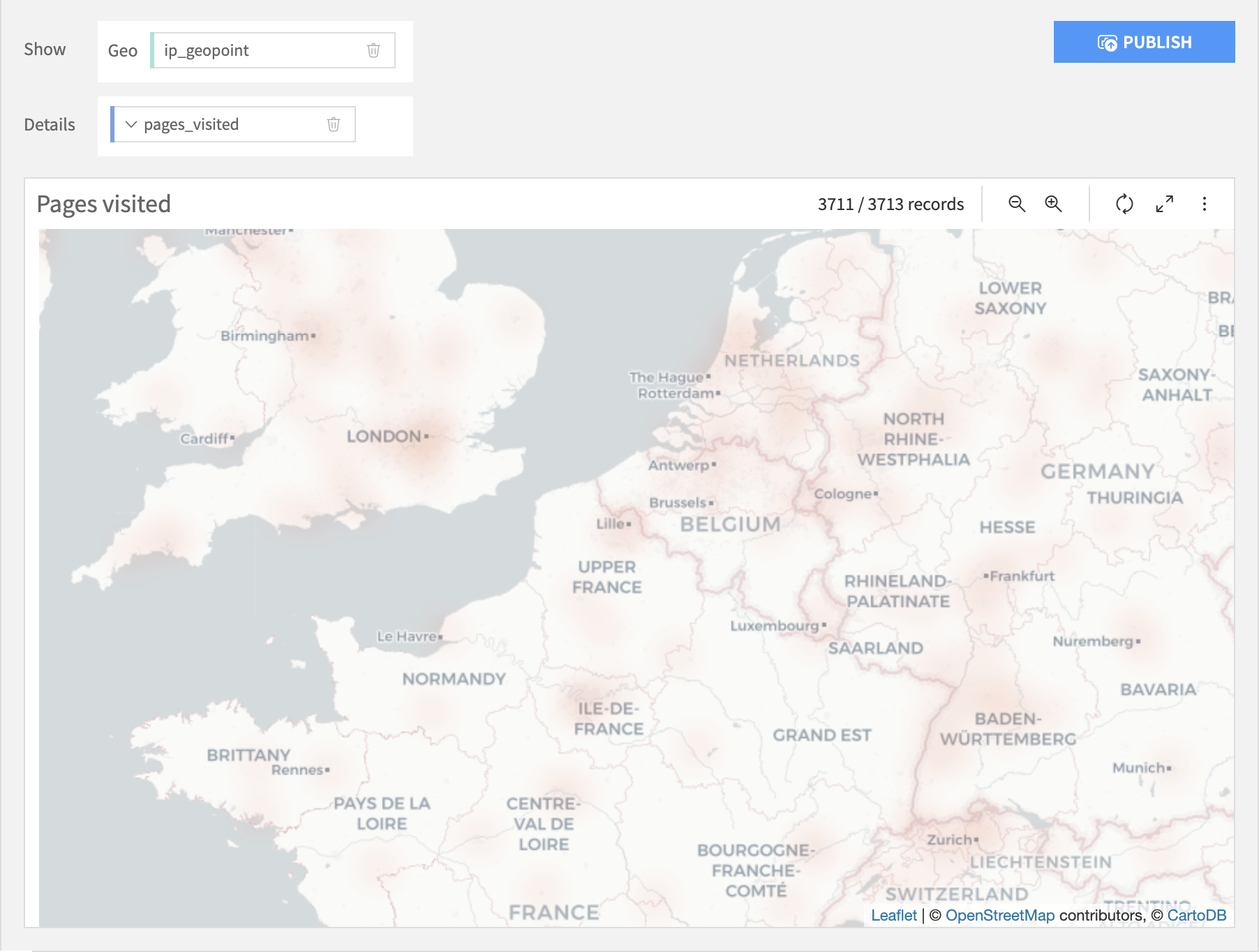
Density
The Density Map layout displays the density of geopoints taking into accounts their spatial proximity and an optional quantitative metric.
The following parameters can be tuned:
Details: Optional quantitative column of the input dataset used as an additional point weight based on its value in the column.
Intensity (global for all points): A global parameter used as a multiplier for the weights of the points. Setting a high intensity will result in a less transparent chart.
Radius (global for all points): A global parameter setting the radius of each point, a higher radius will result in more overlapping between points and higher intensity in high density zones.
Binned
The Grid Map layout plots the geographic locations as rectangular grids on the map. It allows you to add an optional Color column that changes the color of the points based upon the column values. The Color column can be text or numeric.
Note
Map charts cannot be downloaded as images. To share map charts, publish them to a dashboard or take a screenshot of the map to generate an image of the map chart.
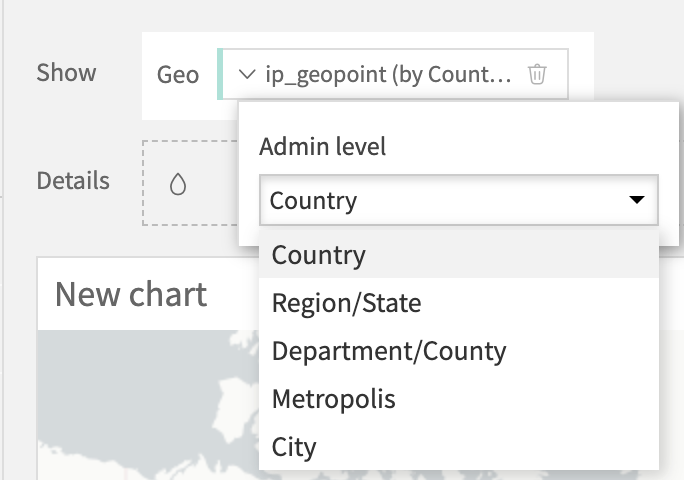
Administrative
Note
Administrative maps are considered a BETA feature. You might encounter issues while using it, and we do not guarantee that this feature will keep working the same way in future versions.
To create Administrative maps, you must install the Reverse geocoding plugin, which provides the bundled-data reverse geocoding capability used by Administrative maps. See Geocoding and reverse geocoding for details.
Administrative maps are aggregated charts: rows in your dataset are aggregated by administrative levels; for example:
By country
By region
By city
You can change the “level of aggregation” by opening the settings of the Geo column.
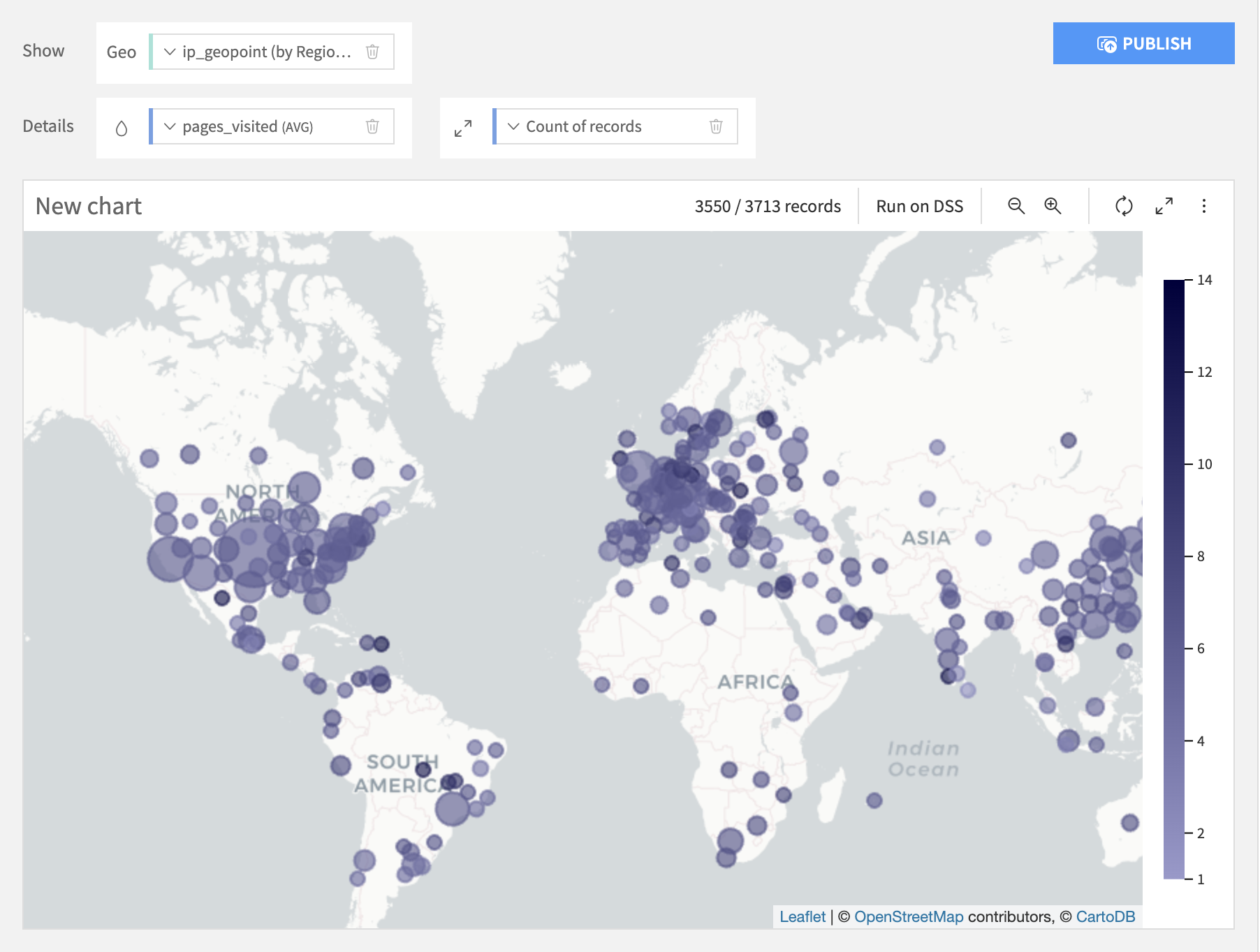
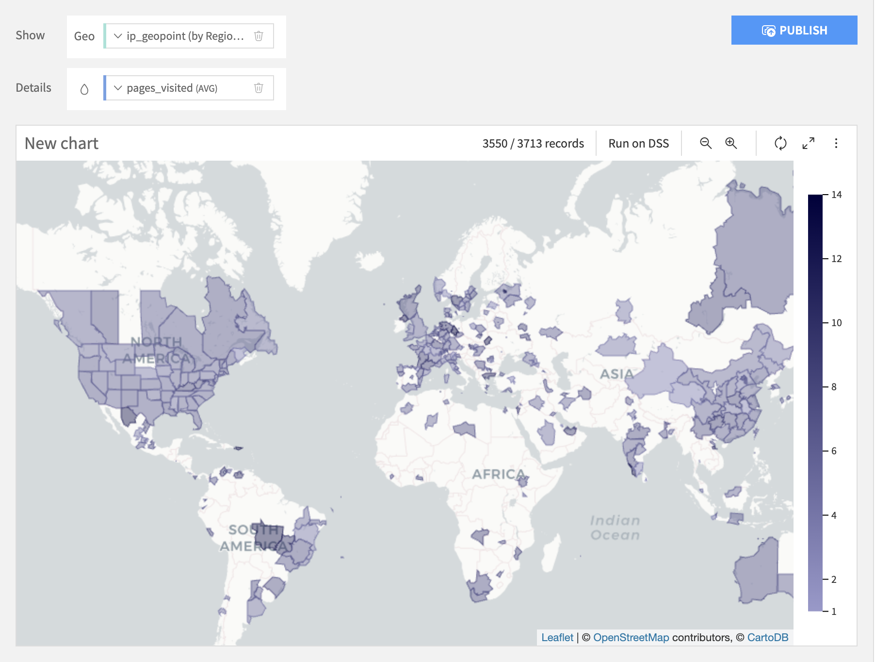
Two kinds of Administrative maps are available:
In the Bubbles layout, each administrative level is represented by a circle. You can assign measures to both color and size.
In the Filled layout, each administrative level is represented by its real polygon. You can assign a measure to the color
Geographic columns
A geographic column is either a point or another kind of geometry. Valid geographic columns are detected as “Geopoint” or “Geometry” in the exploration component.
Geographic columns can be obtained in DSS:
By reading a GeoJSON or Shapefile dataset
By reading any dataset containing a column in WKT format
By applying a geocoding processor in a preparation script
By applying a “Resolve GeoIP” processor in a preparation script
Map backgrounds
DSS comes pre-bundled with map backgrounds provided by Carto.
More map backgrounds can be added by using the Mapbox map backgrounds plugin, which you need to install. Please see Installing plugins.
To use Mapbox map backgrounds, configure the plugin settings with a Mapbox access token. By default, the plugin can add the default Mapbox styles to the list of available map backgrounds. You can also add custom Mapbox styles in Additional styles, with one style per line. Each line must contain the Mapbox style or tileset identifier, followed by a space and a display label. After changing the plugin settings, refresh the DSS page to reload the available map backgrounds.
More map backgrounds can also be added by using the WMS maps backgrounds plugin, which you need to install. Please see Installing plugins.
To use WMS map backgrounds, configure one or more WMS services for the plugin. For each service, provide the service URL and the layer identifier. After changing the plugin settings, refresh the DSS page to reload the available map backgrounds.
In addition, you can create your own plugins to add other backgrounds.