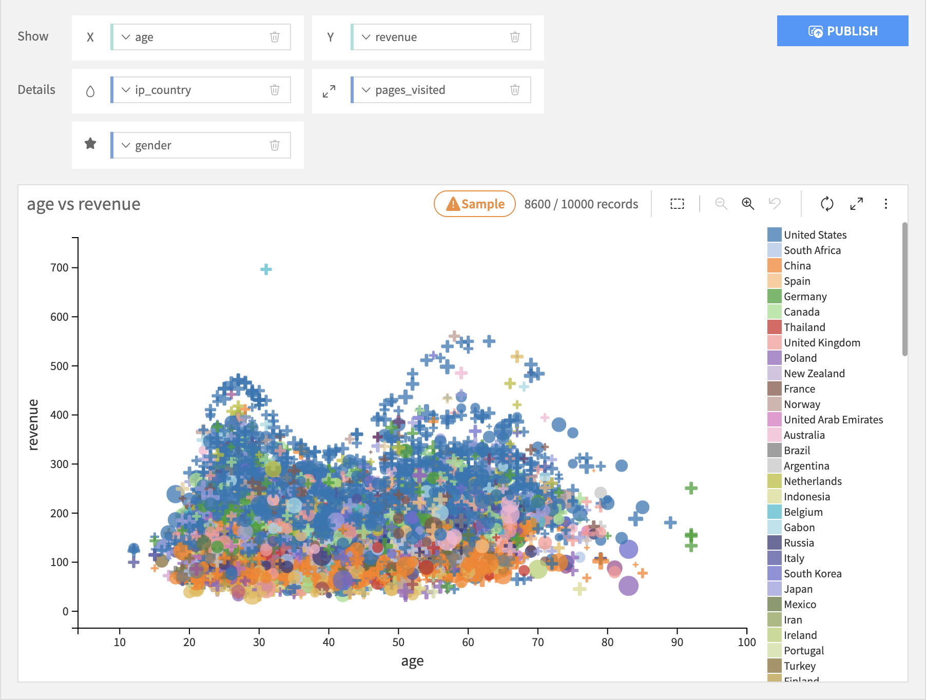
Scatter Charts
The Scatter charts build visualizations that display plotted points, based on the following types of columns:
Required X and Y axis columns, whose values determine the location of the plotted points.
An optional Color column that colors the points based upon the column’s values. If the Color column is not specified, then the points have a uniform color.
An optional Size column that sizes the points based upon the column’s values. If the Size column is not specified, then the points have a uniform size.
Chart Layouts
Basic
The Scatter Plot layout allows you to add an optional Shape column that changes the shape of the points based upon the column’s values. The Shape column should have a relatively limited number of value to avoid clutter.
The Basic Scatterplot plots a point at each individual X-Y value combination. Thus, each point has a single value from the Color, Size, and Shape columns, and these columns can be text or numeric.
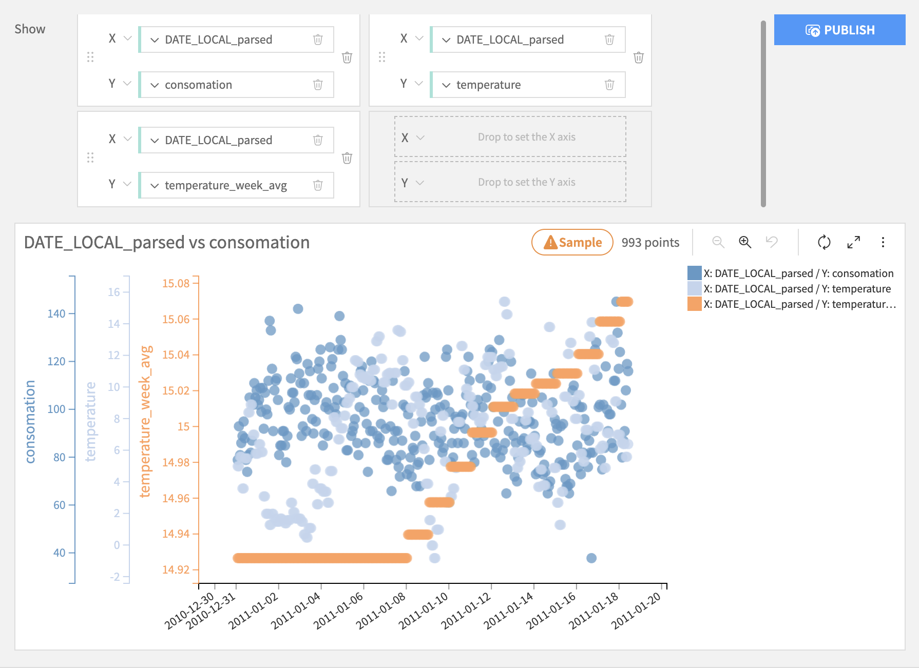
Multi-pair
The Scatter multi-pair chart allows you to add multiple pairs of X-Y value combinations. The points are assigned a color, corresponding to the pair that they belong to. Therefore, it is not possible to define a color dimension on this chart. The size and shape options are also not available. Each pair has a separate y axis that can be individually formatted. The x axis is common for all the pairs.
Both the x and y dimensions can be either numeric or date. However, the column type used for the x dimensions has to be consistent (either all numeric or all date).
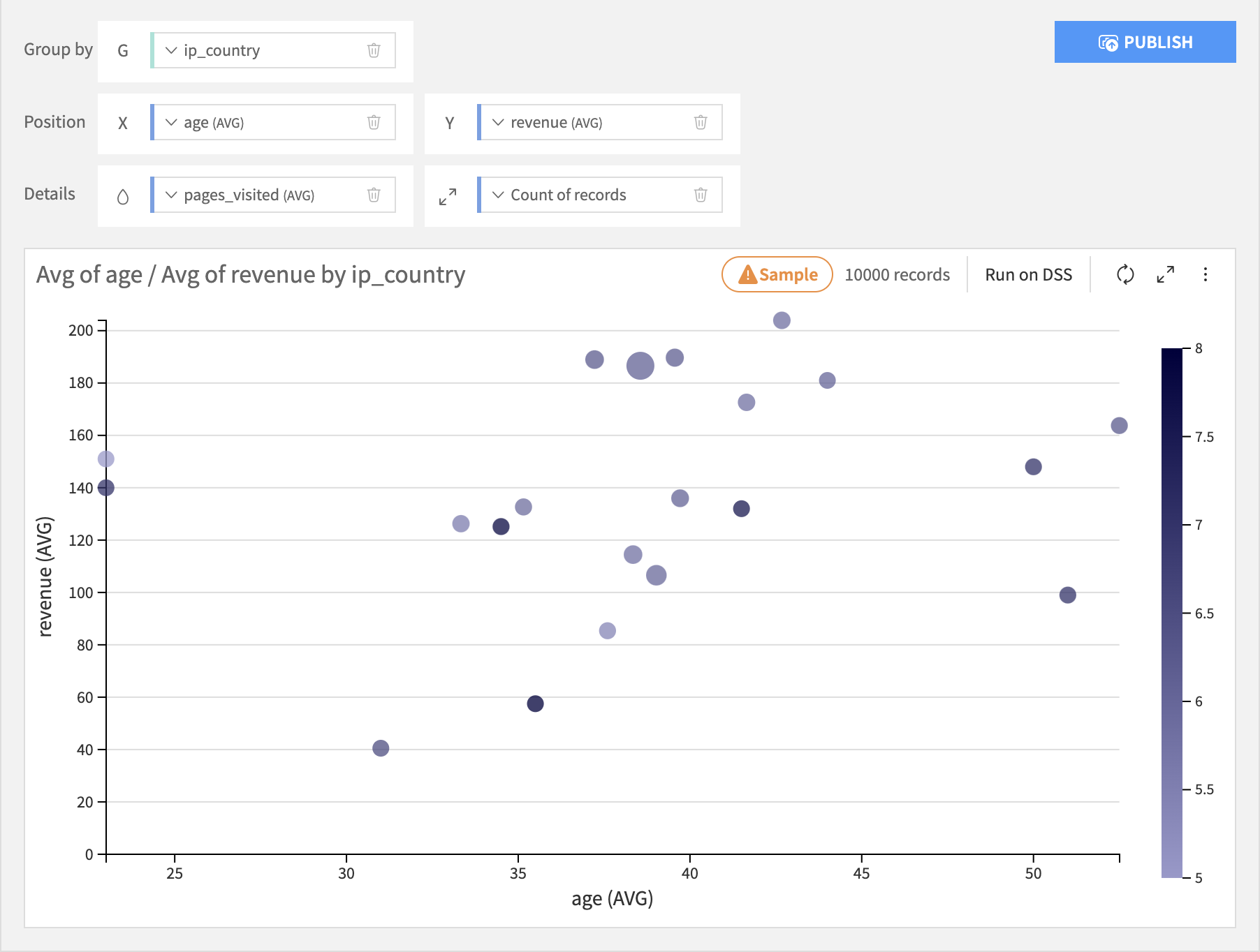
Grouped
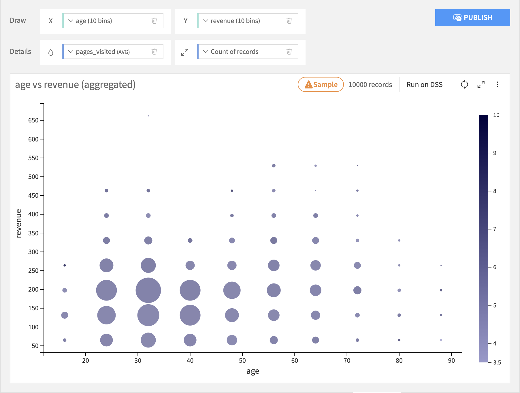
The Grouped Bubbles layout adds a required Grouping column. First the Grouping column is discretized into bins. For each binned value, it plots one point in the chart. The X-Y location of each point is determined by aggregating the X and Y axis columns. Likewise, the color and size of each point is determined by aggregating those columns, if specified. The X and Y axis, Color, and Size columns must all therefore be numeric, so they can be aggregated.
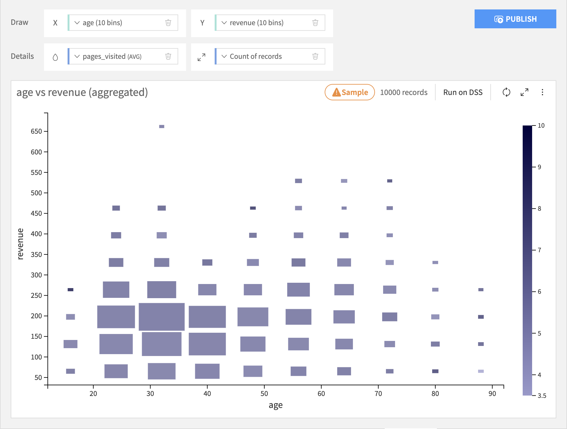
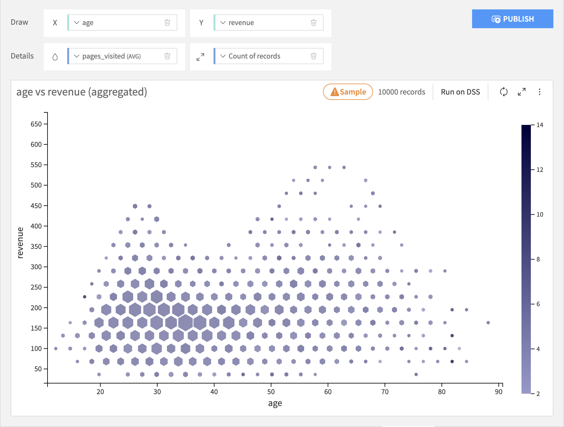
Binned
Binned Scatter charts discretize the values of X and Y axis columns, and create one point for each X-Y bin. The dimensions do not need to be numerical. The color and size of each circles are represented using aggregations of measures.
The Bubble layout allows the X and Y axis columns to be text or numeric. If an axis column is text, its raw values are used.
The Rectangle layout is like the Bubble layout, but instead of points it plots rectangles. The resulting chart resemble a heat map.
The Hexagon layout requires both the X and Y axis columns to be numeric. Hexagonal binning generally provides a better overview of the distribution of your data than the Bubble or Rectangle plots, and can better represent large amounts of data.
Warning
Hexagonal binning is incompatible with live in-database processing. If you use in-database processing and want to enable hexagonal binning, you will need to switch to DSS Charts Engine.
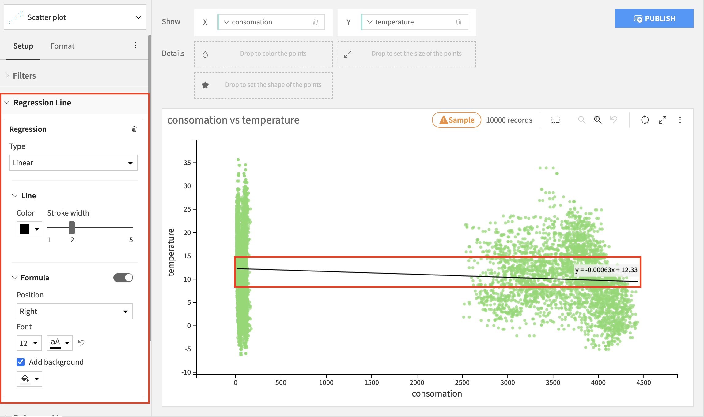
Regression line
The regression line shows a relationship between the x and the y variables. It is possible to add a regression line on a scatterplot chart with both numerical or both date axes. There are 4 types of regression to choose from:
Linear
Polynomial
Logarythmic
Exponential
While it is always possible to calculate a linear and polynomial regression, the logarithmic regression can only be calculated for x values bigger than 0, and the exponential regression can only be calculated for y values bigger than 0. If your chart contains values that do not match these criteria, the regression line will still be drawn but it will not take those values into account.
The regression line is customizable - apart from type, you can also choose a line color, the stroke width, add a regression formula and customize its position, font size, font color, and background.