
Visualization themes
Dataiku visualization themes allow you to share your corporate colors and guidelines across all charts and dashboards in all projects, and apply a set of style changes to a chart or a dashboard in one click. All users can customize themes for a specific chart or dashboard, and administrators can save and share these customizations by creating new themes. This article describes all you need to know to leverage visualization themes.
Applying a theme
Follow these steps to apply a theme from the ones available in your instance.
Locate the theme panel:
From a dashboard in edit mode, open the theme panel from the left bar.
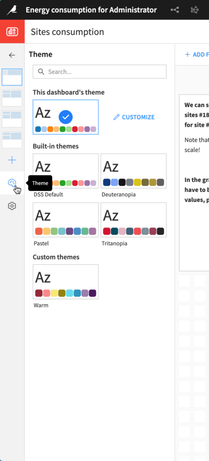
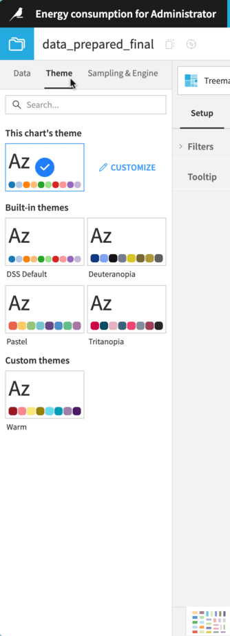
From a chart or chart insight in edit mode, open the “Themes” tab.
There are two ways of applying a theme:
Select one of the available themes in the theme panel.
Click on the “Apply” button at the bottom of the theme customization interface (see the Customize visualization themes section for more information on theme customization).
Both actions behave identically.
Applying a theme will override your current chart or dashboard styles with the theme styles. It’s possible to revert the application of a theme for a few seconds using the “Revert” button of the snackbar displayed at the top of the screen.
Note
If you migrated existing projects to DSS 14.0.0, please note that the charts and dashboards from these projects will not automatically have a theme applied; they will retain their previous appearance prior to the migration. If you want them to use the styles of a theme, you can then open them and manually apply the theme of your choice.
Customize visualization themes
Dataiku comes with built-in themes that reflect its visualization default styles and a few popular alternatives. You can also customize them as you wish.
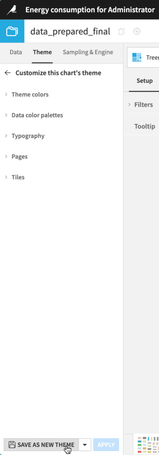
To customize a theme, open the theme panel of your dashboard or chart, and then click on “Customize” on the right of the current theme’s miniature. From there, you can start editing the different theme properties. To locally save and see your changes, click on the Apply button at the bottom of the panel.
The customizations made and applied to a chart or dashboard only affect this chart or dashboard and cannot be accessed by other objects. For information about sharing your theme across all instances, please refer to the Create and manage themes section below.
Note
Copying a chart includes its visualization theme. If you want to reuse a chart’s theme without making the theme available to the whole instance, you can copy and paste this chart, and then modify it.
Theme colors and data color palettes
Dataiku visualization themes allow you to choose from 8 to 20 theme colors that will be used in various places.
The default data color palettes are generated using these rules:
All the theme colors are used to generate a discrete color palette. You also have the option to extend the discrete color palette with automatically generated variants for each theme color. Each variant is a darker or lighter version of a theme color, depending on which offers the best contrast. Darker variants are positioned before the base theme color, while brighter variants are placed after it, creating pairs of colors.
The first theme color and a lighter variation of it are used to generate a default continuous data color palette and a reverse alternative.
The first two theme colors are used to generate a divergent data color palette.
Typography
Visualization themes allow you to customize the font family used in your charts and dashboards. You can choose one of the font families that comes with Dataiku or use a custom one by typing its name in the selector.
Note
If you wish to use a custom font family, please note that this font should be installed on every device from which you access Dataiku. If the font is not available, Dataiku will default to its own default font.
In addition to the font family, visualization themes allow you to customize the default font size and colors for the hierarchical title levels of your charts and dashboards:
“Page titles” affect the dashboard pages.
“Tile titles” affect the dashboard tile titles.
“In-chart titles” affect axis titles, KPI labels, and Gauge chart labels.
“Legends” affect chart legends.
Pages and tiles
Themes also allow you to customize the default styles for dashboard pages and tiles, such as colors, spacing, and borders.
Create and manage themes
Creating a theme starts with customizing an existing theme. Once you have customized a theme, you may want to make it accessible across your Dataiku instance. To do so, you will need to create a new instance visualization theme. Custom instance visualization themes can also be deleted, and theme definitions can be downloaded as JSON files.
Note
If you customize a theme to save it as a new instance theme, we recommend you do so from a dashboard. A single chart won’t allow you to visualize all the theme properties before saving it, and instance visualization themes aren’t editable. Moreover, creating a theme from a dashboard allows you to apply your theme to different chart types at once.
JSON export
To get the JSON definition of a visualization theme, all users can open the Customization interface in the Theme panel and click on the “Export as JSON” button. This action is also available for administrators as a secondary action to the “Save as new theme” button.
Creating a new instance visualization theme
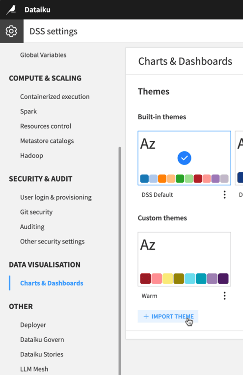
Only administrators can create instance visualization themes, and there are two main ways to do so:
Access the chart or dashboard that uses the theme you want to share, open the customization interface, and click on the “Save as new theme” button at the bottom.
Import the theme’s JSON definition in the Administration settings, in the Data Visualization > Charts & Dashboards section.
Delete an instance visualization theme
To delete an existing instance visualization theme, navigate to the Administration settings and open the Visualization > Charts & Dashboards section. From there, you can delete any custom theme. Deleting a theme won’t affect existing charts and dashboards using this theme, they will continue to look the same until they are updated to use another one.
Select the instance’s default visualization theme
To select the instance’s default visualization theme, navigate to the Administration settings and open the Visualization > Charts & Dashboards section. From there, you can select the theme by clicking on its miniature and saving the change.
The instance’s default theme will be used as the default theme for future charts and dashboards, but selecting a new instance’s default theme does not update existing charts and dashboards.
Control how chart insights are themed in dashboards
Chart insights, like other charts in Dataiku, have their own theme that you can choose and customize. However, when they are published in a dashboard, you could expect them to use either their own theme or the theme of the dashboard. This section details how to control this behavior.
When publishing an existing chart to a dashboard, you can decide whether to use the dashboard theme or the source theme, which is the theme of the chart itself.
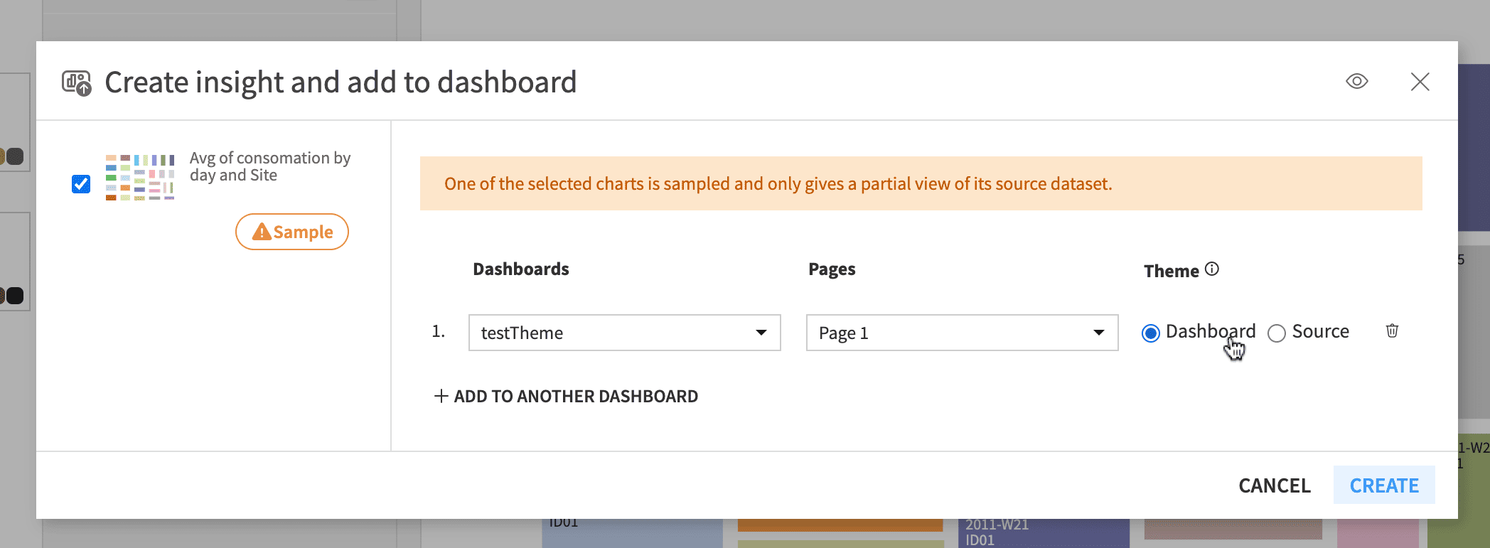
This option is then editable from the dashboard chart tile options. Checking “Ignore dashboard theme” allows the use of the chart’s source theme, while unchecking it allows the application of the dashboard theme to this tile’s chart.
If you decide to use the dashboard theme to enforce consistency, it will be applied over the chart styles. If you want to see your chart as it appears on its own page and keep customizations made in the chart “Format” tab, you must use the chart source theme.