
Univariate Analysis
Univariate analysis is useful for exploring a dataset one variable at a time. This kind of analysis does not consider relationships between two or more variables in your dataset. Rather, the goal here is to describe and summarize the dataset using a single variable.
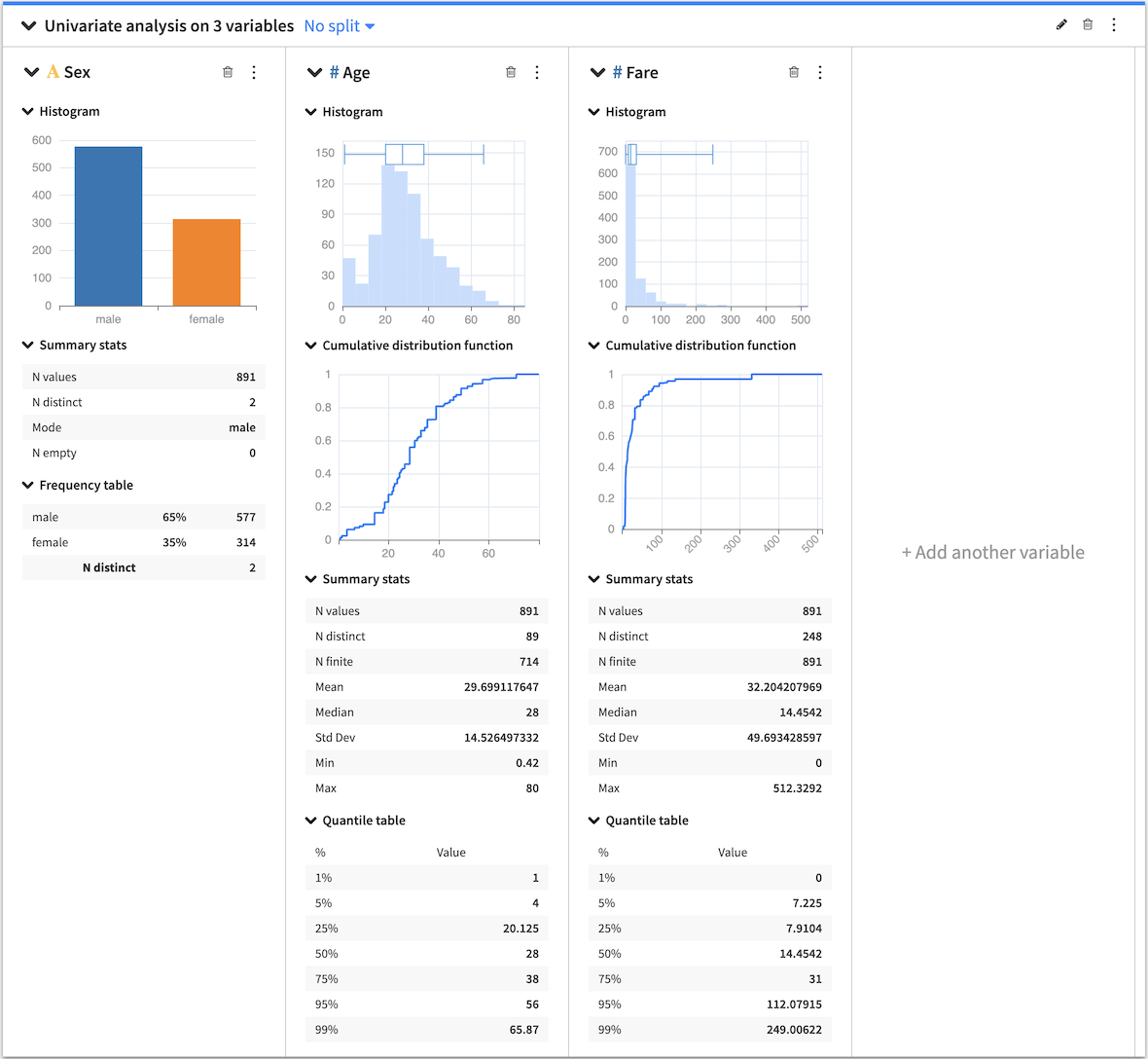
The Univariate analysis card allows you to select multiple variables from your dataset so that you can see the individual distributions for the variables side-by-side. Dataiku DSS creates a section in the card for each variable and, depending on the type of variable (continuous or categorical), populates each section with the appropriate statistical analysis options.
When you create a card, each section has a general menu (⋮), a deletion button (🗑) as well as a configuration menu (✎).
Clicking the general menu (⋮) provides options to:
Treat the variable as categorical or continuous — this affects only the current univariate analysis.
Duplicate the section to a new card
View the JSON representation of the section
Export the section to a dashboard
Clicking the configuration menu (✎) provides options that are specific to the card.
You can also use the top-level univariate analysis card general menu (⋮) to export the univariate analysis as a recipe in the flow. When creating a univariate analysis recipe from a worksheet card, its settings are copied from the worksheet and the card, such as the sampling or the container configuration for instance. All the recipe settings are independent from the worksheet settings and can be subsequently modified from the recipe settings page.
Card options
Several statistical options are available when generating a univariate analysis.
Histogram
Numerical histogram
The numerical histogram shows the distribution of a continuous variable. By default, DSS automatically chooses a number of bins, configurable by clicking the histogram configuration menu (✎). When you select the box plot along with the histogram, both plots are placed in the histogram chart.
Categorical histogram
The categorical histogram (also known as a bar chart) shows the distribution of a categorical variable. DSS sorts the bins by the count of records in descending order. However, you can configure the bins by clicking the histogram configuration menu (✎).
Box Plot
The box plot is a graphical tool that summarizes the distribution of numerical data by showing quartiles. When both the histogram and the box plot are active, the box plot is placed in the histogram chart.
Summary Stats
Summary statistics are scalar values that highlight key information about the values in your dataset (continuous or categorical). Examples are min, max, mean, and median. By default, DSS displays only a selection of summary statistics, based on whether the variable is continuous or categorical. However, it is possible to add more statistics by clicking the summary configuration menu (✎).
Quantile Table
Computes the quantiles of a continuous variable. You can use the default quantiles or define custom quantiles by clicking the Quantile table configuration menu (✎).
Frequency Table
The frequency table shows categorical data in a compact form by displaying the count of records and percentage frequency in descending order. You can configure the number of displayed values by clicking the frequency table configuration (✎).
Cumulative Distribution Function
The cumulative distribution function provides a graphical way to visualize the distribution of any continuous variable. It shows, for any value x living in the range of the variable, the probability that a random sample of the variable gives a value being less or equal than x.