
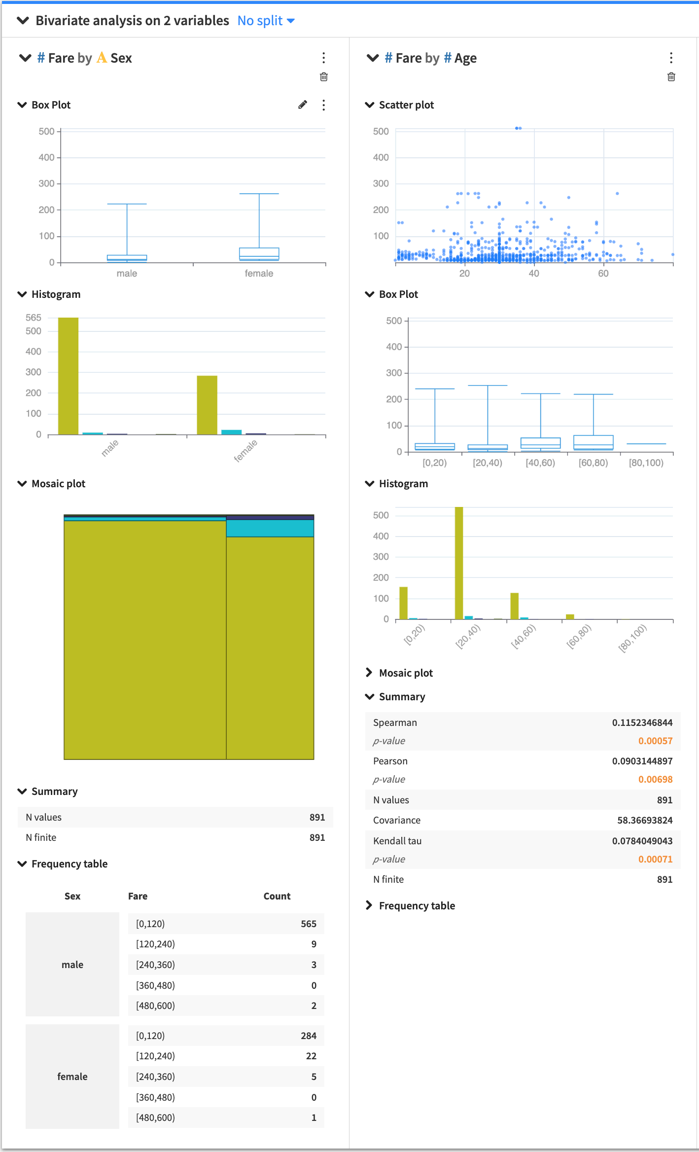
Bivariate Analysis
Bivariate analysis is useful for analyzing two variables to determine any existing relationship between them.
The Bivariate analysis card allows you to look into the relationship between pairs of variables, where one variable is the response variable and the other is a factor variable. You can select multiple factors, and Dataiku DSS creates a section in the card for each pair (factor and response). Depending on the types of factor and response variables (continuous or categorical), Dataiku DSS populates each section with the appropriate statistical analysis options.
When you create a card, each section has a general menu (⋮), a deletion button (🗑) as well as a configuration menu (✎).
Clicking the general menu (⋮) provides options to:
Treat the variable as categorical or continuous — this affects only the current bivariate analysis.
Duplicate the section to a new card
View the JSON representation of the section
Export the section to a dashboard
Clicking the configuration menu (✎) provides options that are specific to the card.
Card options
Several statistical options are available when generating a bivariate analysis.
Histogram
The bivariate histogram shows the distribution of a variable in relation to another. By default, DSS automatically chooses a number of bins, configurable by clicking the histogram configuration menu (✎).
Box Plot
The box plot is a graphical tool that summarizes the distribution of data by showing quartiles. To create the box plot, at least one of the variables must be numerical.
Mosaic Plot
The mosaic plot is a visual frequency table, where the area of each rectangle is proportional to the frequency of the variable. By default, DSS automatically chooses a number of bins, configurable by clicking the histogram configuration menu (✎).
Scatter Plot
The scatter plot uses Cartesian coordinates to display the values of two numerical variables in a dataset. By clicking the scatter plot configuration menu (✎), you can configure:
the size of the points in the plot
the maximum number of points to display
The points to display are randomly drawn from the sample of the worksheet. See worksheet elements for more information about sampling.
Summary Stats
Summary statistics in a bivariate analysis card compute the correlation between a pair of variables using correlation coefficients (Spearman, Pearson, Kendall tau, etc). You can specify which statistics to display by clicking the summary configuration menu (✎).
Frequency Table
The bivariate frequency table shows the distribution of one variable across the categories of another variable. DSS sorts the values in increasing order of the categories (first by the factor, then by response). You can configure the number of displayed values by clicking the frequency table configuration menu (✎).