
Build custom pages
Overview
The Custom Page Designer is available from the Waffle menu. It allows administrators to create custom pages in addition to the standard pages.
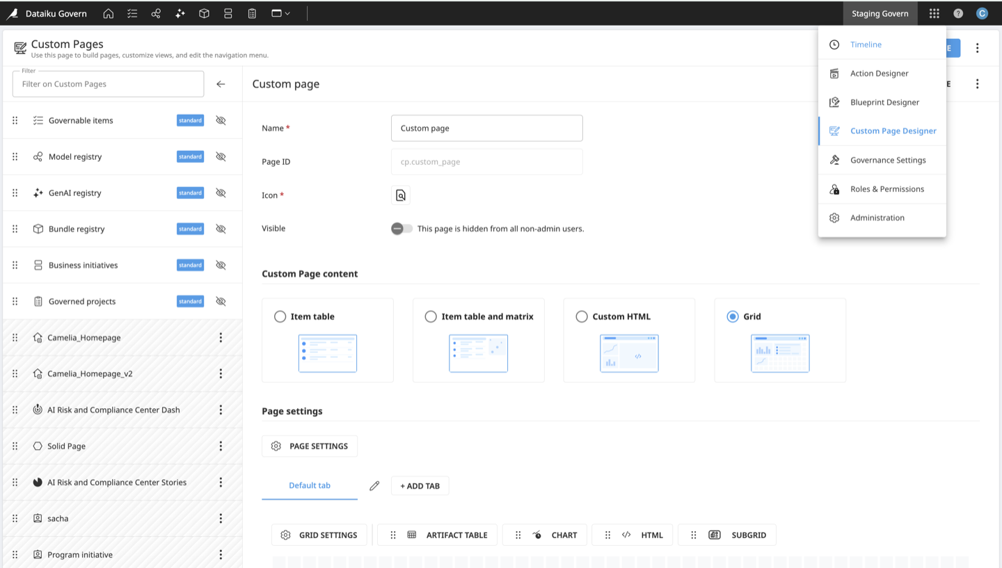
With the Custom Page Designer, you can:
Use a grid page to create flexible multi-tab layouts:
Arrange the available tile types side by side, including item tables and charts.
Use subgrid tiles to create nested grids with their own tiles and data settings.
Choose which items to display using filters.
Use both standard and custom blueprints.
Add custom actions.
Use predefined pages for simpler needs, such as a table, a table with a matrix, or custom HTML.
Create and manage pages
When creating a custom page, define its name, page ID, and an icon. The page ID is prefixed by cp. and cannot be changed after the page is created. The page ID is used in the URL for navigation.
From the page list, you can:
Search standard and custom pages.
Hide or unhide standard and custom pages.
Reorder standard and custom pages by dragging and dropping.
Import and export custom pages as JSON files to transfer them between Govern nodes.
Delete custom pages.
When the page is ready, make it visible to publish it.
Note
Standard pages cannot be edited or deleted. You can reorder them or hide them from the navigation menu.
Grid pages
A grid page lets you create a custom page composed of one or more subpages, each represented by a tab. Each tab contains a configurable grid in which you can add, arrange, resize, edit, and delete tiles.
Tabs
Each grid page initially includes a Default tab. Use tabs to organize the custom page into subpages. For each tab, configure its name, ID, and an icon, choose whether to display the right panel with details for the selected item, then add the tiles that compose its content.
Tiles
The available tile types are:
Artifact Table to display a selection of Govern items and configure the columns visible to users
Chart to visualize Govern item data
HTML to display custom HTML content and preview it before adding the tile
Subgrid to create a nested grid with its own tiles and data settings
Page settings
Use Page settings to configure the data available to the grid and the page behavior.
Data settings
The data settings define the items displayed on the page and the data available to chart tiles:
Item settings: Use filter conditions to narrow the set of items available on the page. The filtered result is used by all artifact table and chart tiles on the page.
Projection settings: By default, only item IDs are loaded. Add projections to make additional item data available to chart tiles. Artifact table tiles load the required item data directly and do not require projections.
Category
Available projection types
Basic projections
Artifact ID (unique), Item name, Workflow step, Field
Advanced projections
Item path, Blueprint path, Blueprint version path
Breakdown settings: Configure how projected data is grouped and summarized. Add one or more dimensions to define the groups, then add measures to calculate their values.
Measure type
Available aggregation functions
Standard aggregations
Count, Sum, Average, Minimum, Maximum, Median, Sum of squares, Standard deviation
Custom aggregation
A custom JavaScript function
By default, a subgrid inherits the data settings of its parent grid. Override these settings to display a different selection of items in the subgrid.
See also
For step-by-step instructions on configuring charts with projections and breakdowns, see the Charts tutorial.
Page behavior
Configure the options available to users from the page:
Display a search bar.
Allow users to create items.
Make custom actions available. For action configuration details, see Action settings.
Chart tiles
Standard charts
To configure a standard chart, enter a title and select:
A chart type: Bar chart, Line chart, Pie chart, Area chart, or Matrix
A Breakdown
A Measure from that breakdown
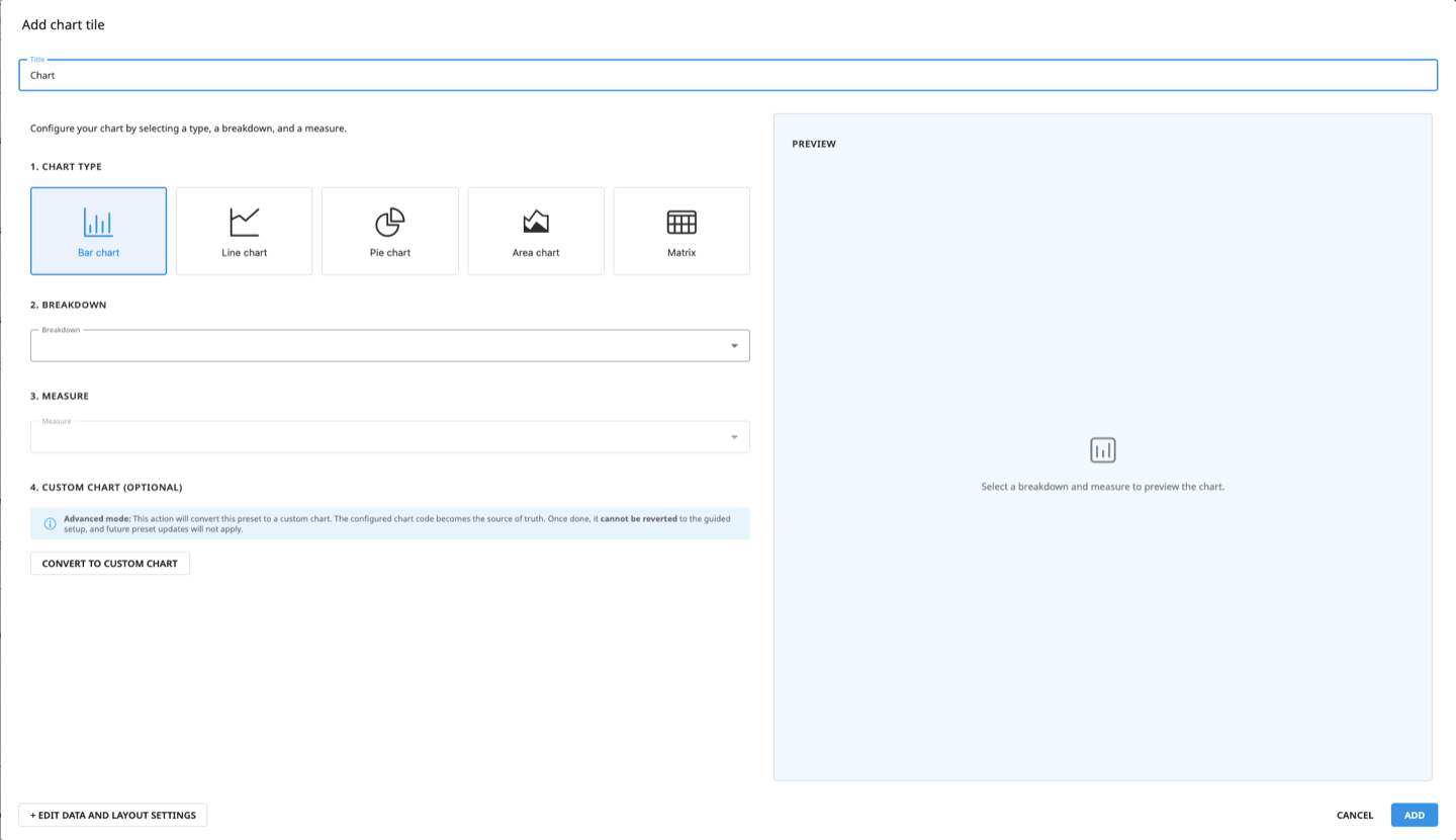
Use the preview to check the result. Load all data or display sample data when the complete result set is not available.
Custom charts
For a more specific visualization, convert the standard chart to a custom chart using JavaScript and ECharts. The editor provides a read-only preview of the breakdown data and a preview of the resulting chart.
Warning
Converting to a custom chart cannot be reverted. The configured chart code becomes the source of truth, and future updates to the standard chart presets do not apply.
Drill-down
Charts support drill-down. Selecting one or more chart values filters the tables and charts that use the same data settings. Custom charts can register their breakdowns to participate in drill-down.
Other page types
For simpler use cases, choose one of the following predefined page types:
Item table, which displays a table of items
Item table and matrix, which displays a table and a matrix view
Custom HTML, which displays content defined by HTML code
Each page type listed above exposes only the settings required for its layout.
Item table
Item settings
By default, an item table page displays all items. Add one or more filter conditions to restrict the displayed items.
Filter |
Use it to |
|---|---|
Field value |
Filter by values in a selected field, using controls appropriate to its type. |
Item type |
Include or exclude items that use selected blueprints. |
Template |
Include or exclude items that use selected blueprint versions. |
Item |
Include or exclude specific items. |
Archived status |
Include or exclude archived items. |
Name |
Match item names using text conditions. |
Workflow step |
Filter items by the status of a selected workflow step, or any workflow step. |
Sign-off |
Filter items by the status of a selected sign-off, or any sign-off. |
Item contents |
Match text in item content. |
Action settings
Add custom actions to the page menu. For each action, configure:
Action ID: Select a custom action created with the Action Designer.
Action label: Enter the label displayed in the page menu.
Input parameters: Define the optional parameters passed to the Python script when the action runs.
Icon and color: Customize the representation of the action in the page menu.
Table settings
Configure the columns displayed in the table. The following columns are directly available:
Name
Workflow status
Edit row button
To add other columns, select View, choose a blueprint, and enter the corresponding View ID. The View ID field suggests available views for the selected blueprint.
See also
For more information, see Views and view components.
Item table and matrix
In addition to the settings available for an Item table page, configure a matrix view for the page.
Matrix view settings
Configure the matrix view with the following settings:
Matrix label to replace the dynamic title (optional)
X axis and Y axis to define the default matrix axes
Matrix zones
Choose the color gradient applied to the matrix zones. Dataiku provides the Business Value theme, Risk Matrix theme, and Business Initiative theme presets. To define the background and point border colors, select Custom theme.
Custom HTML
Use a Custom HTML page to display HTML content, such as an embedded dashboard or video from Dataiku or an external tool.
See also
To learn how to configure custom pages through examples, see the custom pages tutorial.
Note
This feature is not available with all Dataiku licenses. Contact your Dataiku Account Manager or Customer Success Manager for more information.