Other Charts
These charts do not fit neatly into other classifications.
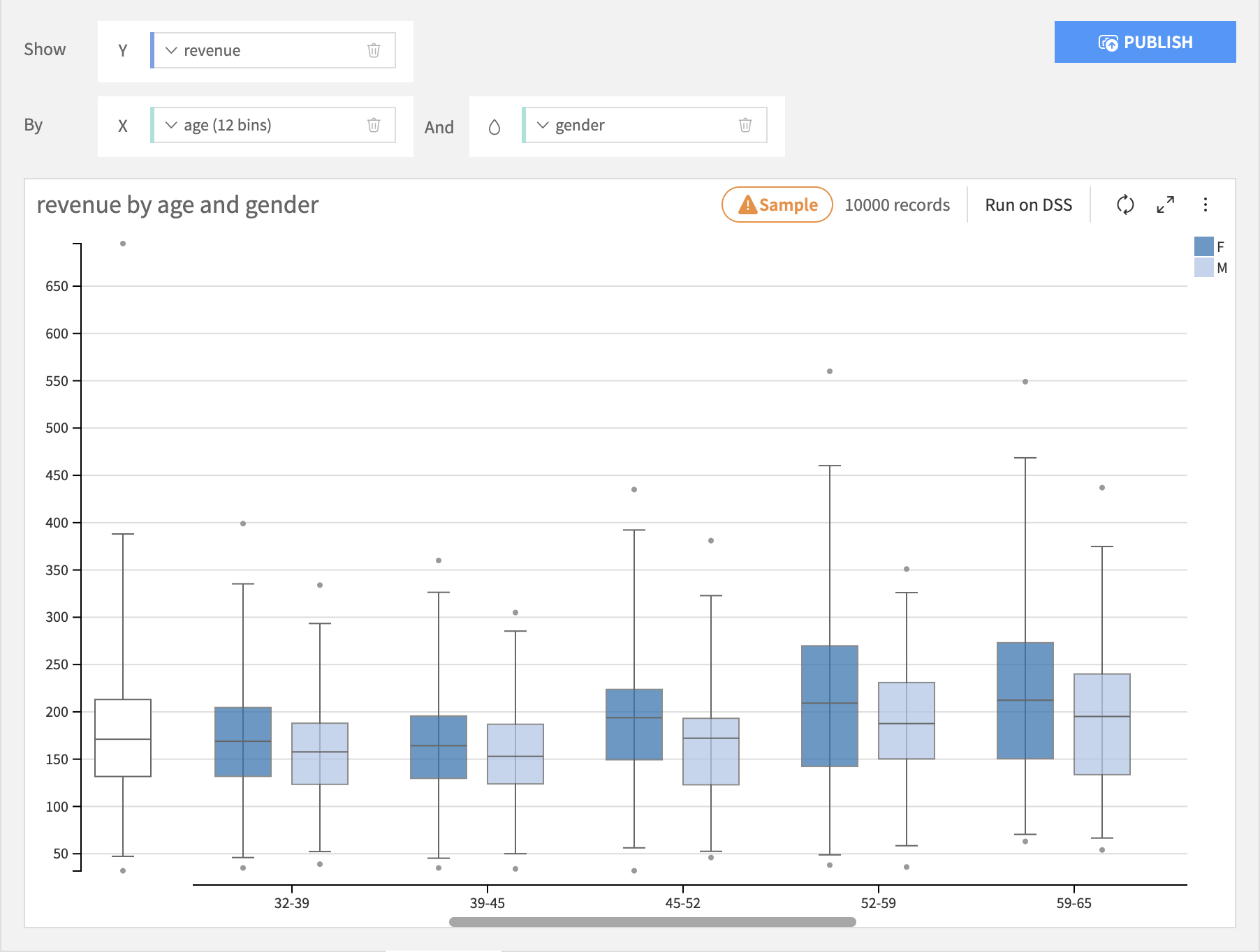
Boxplot
Boxplots build a visualization that shows you the distribution of a required Y axis column, possibly broken down by the bins of an optional X axis column and creates separate boxplots for each subgroup for each bin on the color axis. The Y axis column must be numeric, the X axis column can be numeric or text.
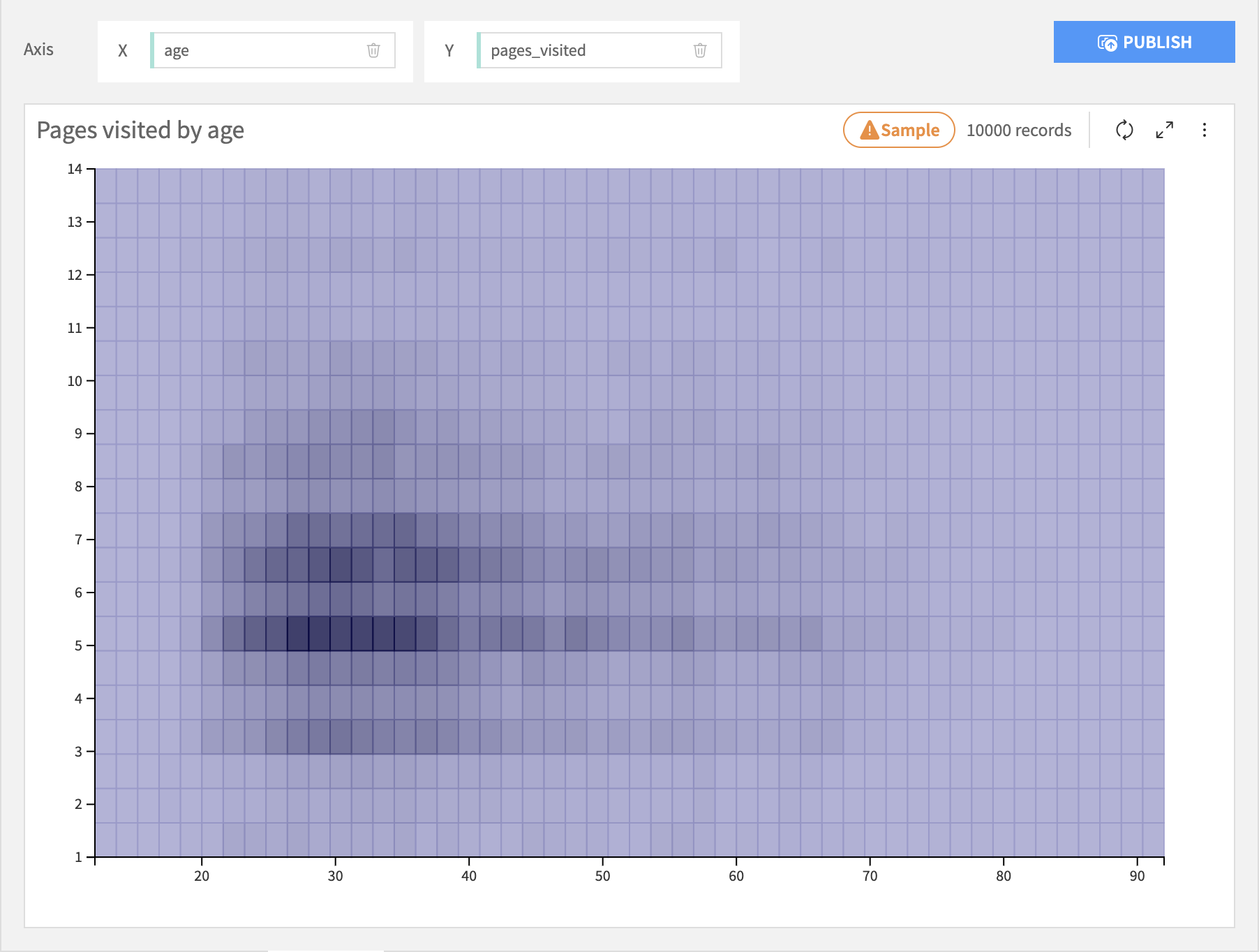
2D Distribution
The 2D Distribution chart builds a visualization that shows you the bivariate distribution of a required X axis column and a required Y axis column. Each column is binned and the resulting cells are colored by the relative density of rows in that cell.
Lift Chart
Warning
This chart type is deprecated. Lift charts are provided for models in Visual ML results.
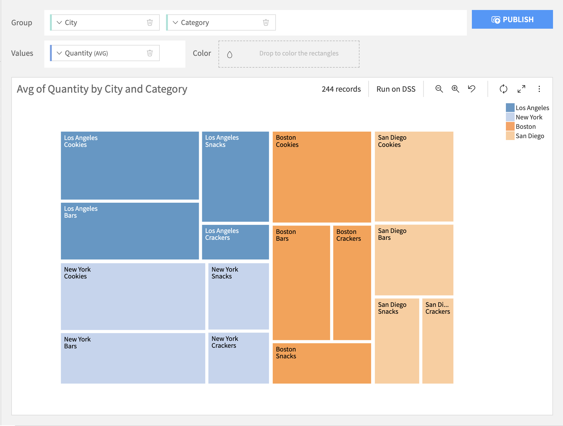
Treemap
Treemap charts build a visualization of the hierarchical structure of tree diagrams. Each parent node is represented by a rectangular area with its children nodes nested inside. The size of each area is dependent on the value of the corresponding node.
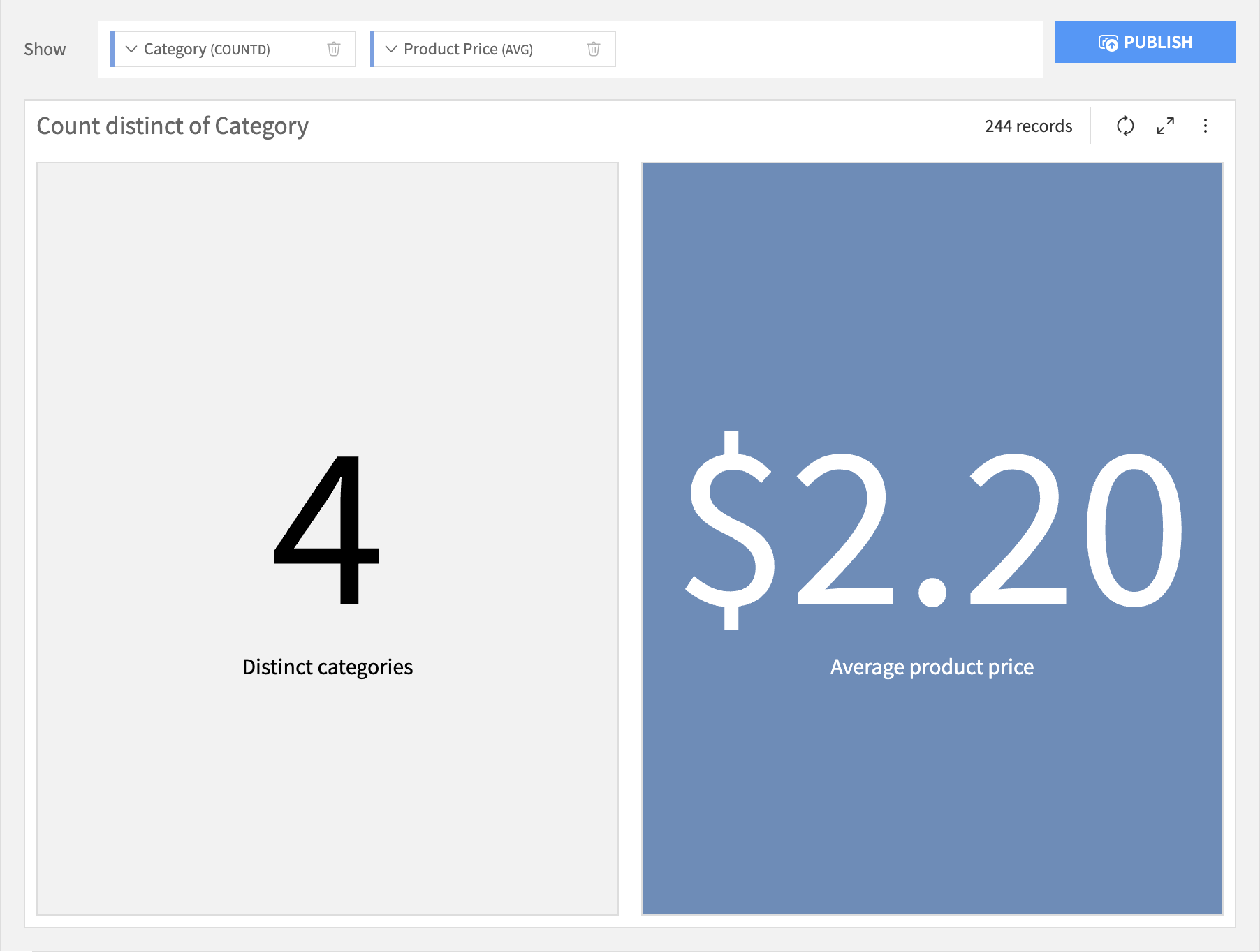
KPI
Standing for “Key Performance Indicator”, KPI charts build a simple value visualization for single or multiple aggregations.
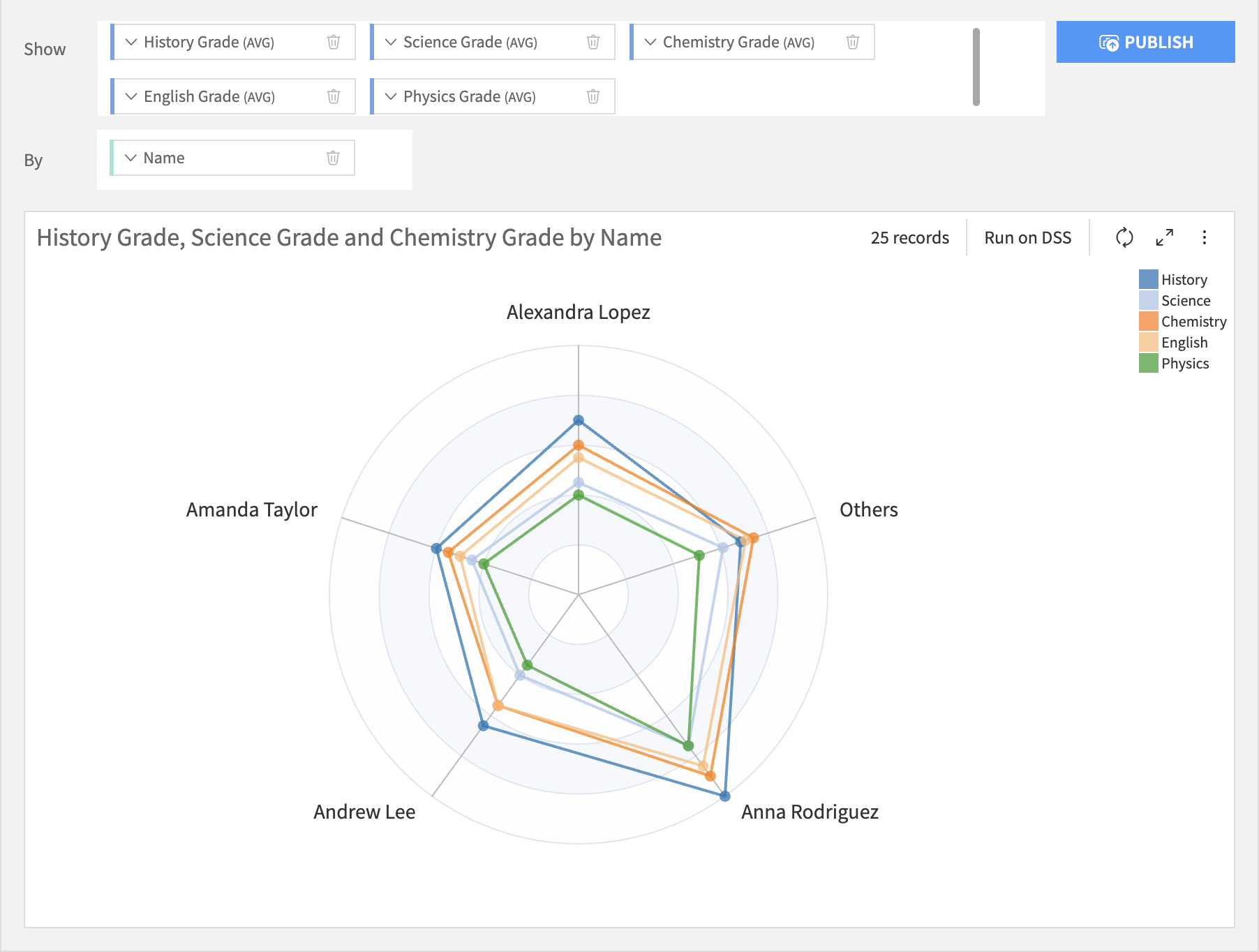
Radar
Radar charts are ideal for comparing multiple quantitative variable, each variable being displayed as a radial axis. The values of the same category are shown as polygon, of which each chart can have 1 or more.
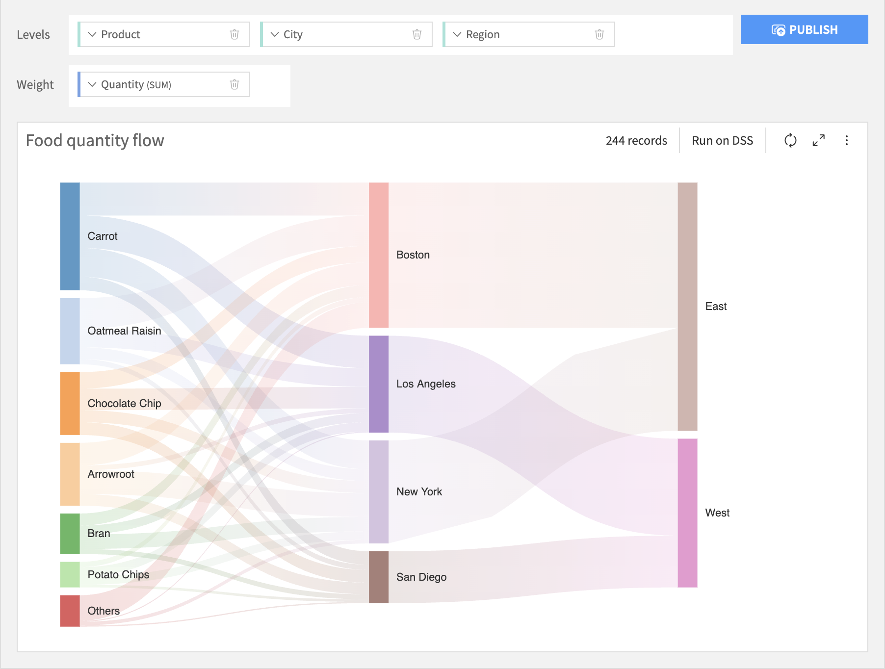
Sankey
A Sankey chart is used to depict the flow of resources, quantities, or values from one set of entities to another. It is a type of flow chart that illustrates data across different categories or stages.