
Create templates in Blueprint Designer
Summary
To create a template for an artifact, you must know how to design a blueprint version.
When designing blueprint versions, you can start by defining how many steps are in the workflow (if a workflow is desired).
The next step is to define which Fields you would like to include on that blueprint version. These will be the fields that Govern users will fill in or view information about the objects to which this template has been applied.
Next, you will define Views, which are the collection of fields that the users will see and interact with. For example, you might create a Project Description field and a Status Update field. Then you create a Overview view which includes Project Description and a Step 1 view that includes Status Update.
Finally, to add a View to the relevant place, you can add the View ID to either the Overview page or the steps you’ve created in the workflow, for instance.
Configuration
General settings
The General tab allows you to define some key information for your blueprint version.
Under the Main section, you can:
Add some instructions for other users.
Define the Parent which is used to define the hierarchy of your govern items for breadcrumbs for users.
Set which View should be used on the Overview page of any item using this blueprint version.
Under the Workflow section, you can:
Create steps for a workflow. Leave this empty if you want to make a blueprint version with no workflow.
Name and re-order your steps. Specify which View ID should be used for each step.
Assign one or more of the steps to require a formal sign-off. You can use the sign-off editor to define who is responsible for signing off in that step for any Govern item created with this template.
Fields
Fields can be defined which contain information and can accept user inputs. Fields can be of the following types:
Field type |
Description |
|---|---|
Number |
User inputs an integer or decimal value. |
Boolean |
This creates a checkbox in the artifact that a user can select or leave unselected. |
Text |
User inputs a string value. |
Category |
Users choose items from a dropdown list. |
Date |
Users input a date value. |
Reference |
Provides other artifacts in Dataiku Govern, for example a specific governed Project. |
File |
Allows users to upload a file. |
Time series |
Mainly used for models metrics graphs. A field from this type cannot be edited directly from the GUI, only through the public API or in a hook. |
Some constraints may be defined on fields depending on their type. For instance:
A Number field can be constrained for its value to be only on an allowed range.
A Reference field can be constrained on which allowed blueprints the reference item must be.
Fields can also be marked as
required.The “is List” checkbox allows users to add multiple values in a single field.
Note
To edit (or view) these fields, users will need to have Write (or Read) permission for that blueprint or field.
Views
As explained in the previous section, a field is akin to a variable which stores a value of a specific type. In order to display or edit a field value on the item page, the field must be embedded in a graphical element named view component. Views are a collection of view components which can be containers and fields.
Once these views are created, users with appropriate permissions can input information into the fields in those views and read the information available from those fields.
Views come in two different layouts, Card and Row.
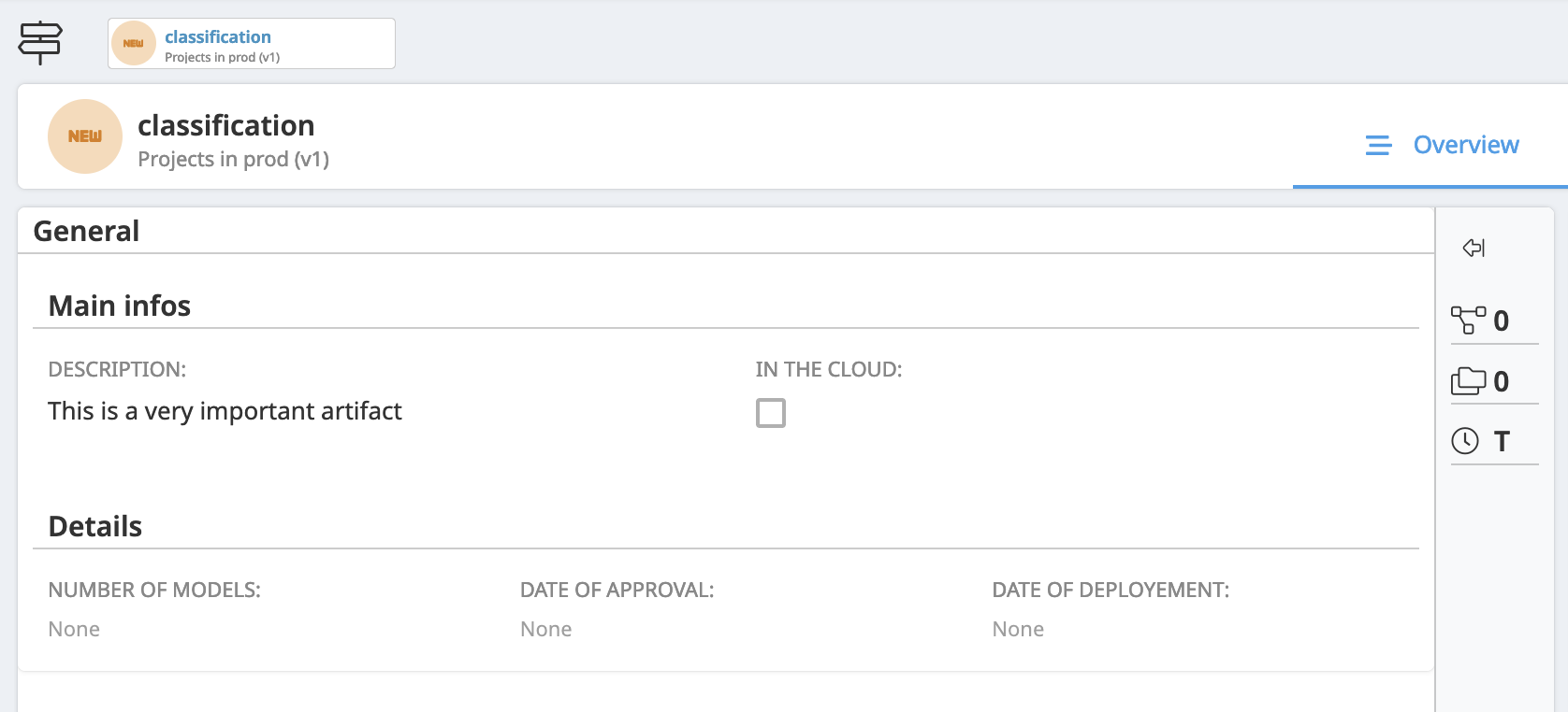
Card views are used to define the content of Overview tab (“Main” view), Workflow steps and in Reference fields.
When creating card views, you can add a single field in it or you can start by adding a container which will allow you to group fields together (“Add View Component” > at the top, change “Type” to “Container”). Then, you can add one or more fields to the container. You can also group fields together in separate groups by creating more containers within the top-level container.
As you’re adding fields to your view, use the three dot menu button on the right side of each field to add or delete fields. You can also rearrange the order using the three horizontal line button on each field listed in your view.
The same Field can be added to multiple Views, for example if you want the relevant piece of information to appear on the Main view and on a workflow step. If a Field is used in multiple Views, if it is modified in any View, it will be changed in all of them.
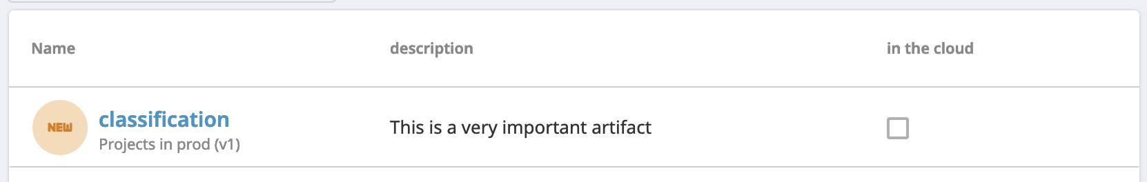
Row views are used to display rows in tables.
Item fields can be edited directly from the table of the custom page.
Views are customizable from the right panel menu. Below, the areas you can configure.
Label: You can define a label for sections and fields.
Description: You can add a description which will be displayed within a tooltip next to the label.
Documentation: You can add an inline documentation written in HTML.
View type: You can define if you want to display the content as a card or a table.
Hooks
Hooks are used to automate actions related to artifacts in Dataiku Govern. They are written in Python and will be run during the artifacts lifecycle phases: CREATE, UPDATE, or DELETE. Which phases are selected to run a hook is configurable.
When you first create a hook, sample code will be included to demonstrate the available functionality. Some examples of how hooks can be used includes calculating a field based on other fields (for example, if you want to calculate a “risk score” based on inputs in a few different fields), or changing the owner of a project based on some criteria, or updating or creating an artifact based on some progress in a specific project or model.